
I’m in love with the idea of “Harvest Decorating” as opposed to Halloween or Thanksgiving specific decor. I’ve never been particularly thematic, and I never really “get” headstones and amputated limbs as decoration.
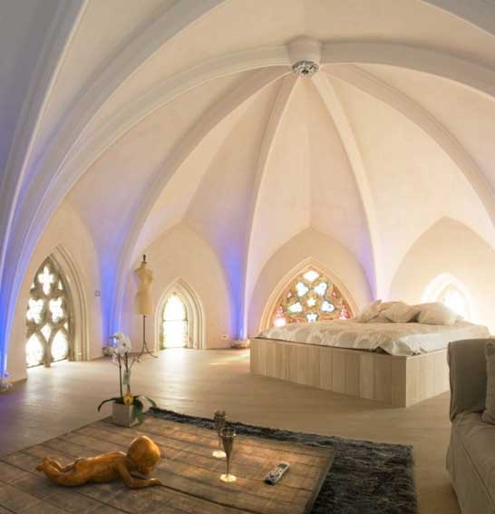
How would I describe a romantic room? I don’t think of it as a room where the romance necessarily happens, but a space that inspires a romantic feeling. The Fontana Park Design Hotel in Lisbon, Portugal (above) is a perfect example for me. Luxurious, other-wordly, and deceptively simple and elegant. It’s like roaming around on a cloud.
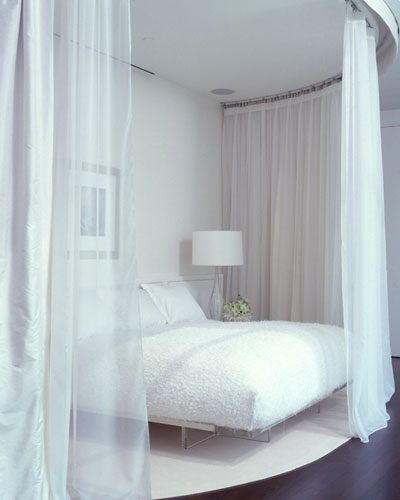
Romance in design is about lighting, textures, colors and overall ambiance. While sexy spaces are very similar, they’re a little darker, edgier, and secretive. A romantic space is more airy, melancholy, sweet, and ethereal. Think medieval maiden mixed with Flokati rugs and billowing linen window coverings. There is usually an element of fantasy in a romantic room intertwined with soft fabrics. Benjamin Noriega Ortiz does an amazing job of creating beautiful rooms that are modern, eclectic, and interesting.
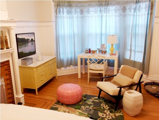
Although pink, fluffy, ruffly, and floral are usually associated with the word romantic, there are many ways to interpret those design elements and keep it modern and fresh. Featured on Apartment Therapy, Cynthia and Oliver’s San Francisco flat has all of above but it was done in a chic, warm, comforting, stylish way. The lines of the furniture are soft and curved, the materials – leather, ceramic, lacquered wood – are sleek and smooth. It’s all pretty seductive!
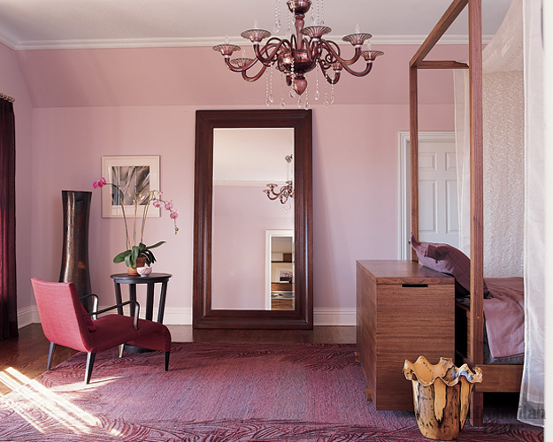
Modern Romantic is as much about the physical aspects of a room as it is the way a room makes a person feel. Above, the mix of heavy and curved lines, spare but elegant accessories, and pink tones creates a blend of feminine and masculine that is a little mysterious and a little melancholy. It’s a contemporary but romantic interpretation of a sitting room.
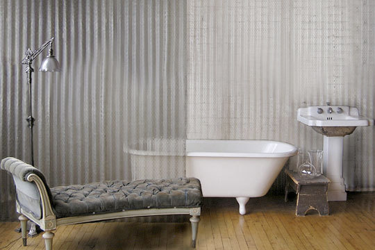
I am madly in love with this bathroom. The industrial + glamor combination is heady stuff for me. It’s such a small gathering of things but it invites you to imagine an interesting, complex and impossibly chic person living there. Velvet, vintage, glass, warm wood, cool steel…it’s all completely romantic.
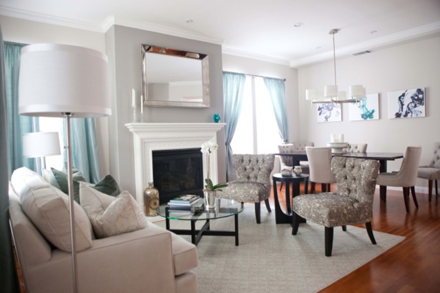
Grace and Dennis Hu’s living room is a good example of Modern Romantic. The raw silk curtains, deep sofa, velvet pillows, brushed nickel and crystal accessories, tufting…Of course, style is subjective. My definition of romantic design is tied to my own likes and dislikes. I absolutely hate chintz and fringed sofas but many people think it creates a romantic ambiance. I think of it as elderly. For some, candles are romantic, but putting them in a Super 8 motel room won’t transform it into a romantic room (sorry). In the end, a room is a room and it’s very much about the memories you create in it and the things it inspires you to do.
Melisa
Back to Main Site
All art is subjective. I may not love velvet Elvis tapestries that much – but there are thousands that do. The same impulse that drives someone to purchase a print of the Eiffel tower from Target is the same impulse that drives me to buy a vintage print of the Virgin Mary.
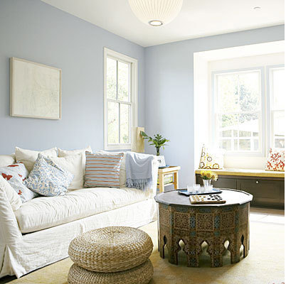
Long ago I read Karen Kingston’s enlightening book, “Creating Sacred Space With Feng Shui,” and much of what I read has become a building block for how I work with my clients to define their current and future space. When it comes to clutter, Kingston’s belief is that we are tied to everything in our home by invisible strings of energy.
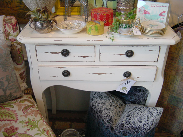
I heart previously loved furniture and objects that had a life previous to Apartment 46. I am attracted to things with a soul. The idea of returning something to its “original” condition bothers me.
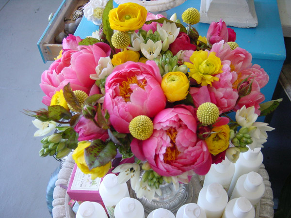
I can hardly believe it’s “that” time of year again but yes, yes it is indeed! Wedding season snuck up on me in the form of lovely Anel “Nellie” Resendez and her upcoming uber colorful and equally large wedding. While the actual event is still a month away, I’ve been busily testing (and re-testing) color arrangements until I come up with one that I feel suitably embodies her exuberant, creative and fun spirit. Regardless of the outcome, bright pink peonies will be the star flower in that bouquet!
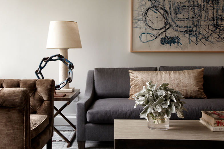 I am mad about New York-based designer James Huniford. This room he designed above and everything in it – yes please! His rooms are places people could actually live in, and that’s important to me. I don’t want to merely possess a space, I want to be a part of it. I am smitten with his individual pieces and his intense attention to detail. Craftsmanship matters, especially when you are deciding which pieces will be an “investment” and which are functional and less costly.
Speaking of less costly, anyone that has worked with me knows that I don’t advocate spending money on expensive furnishings just because they exist. There has to be a reason. There are times I get really upset flipping through my Elle Decor, Veranda, Traditional Home, or Dwell – they show amazing rooms meant to inspire a wide and varied readership but likely only 2% of that readership could actually afford to purchase the items in those same rooms. This morning I was reading Veranda and came to their New and Noteworthy page. I was excited they featured a Huniford chair, at a not-insignificant cost of $3700, but dumbfounded that they also featured a Bottega Veneta trash can, or as BV calls it, Intrecciato Nappa Paper Basket, in woven leather, for $850. A trash can. Made of leather. To put my trash in. (Insert blank stare here) I am confused as to who they believe their demographic is.
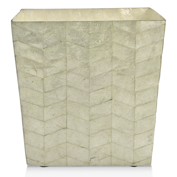
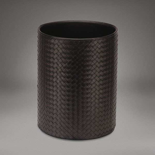 There is probably nothing anyone can say to me to make the purchase of this “paper bin” worthwhile. If you are willing to go that route I will happily purchase you an equally stylish trash can and take the remaining $800 and donate it to one of my favorite charities (or suggest you do the same). Of course there is a huge gap in stylishness between a $9.00 bin and a higher-end container, but a stylish bin to hold your trash never needs to cost three figures. In fact, I just found a gorgeous bin made of capiz shell for $45 and that felt weirdly indulgent.
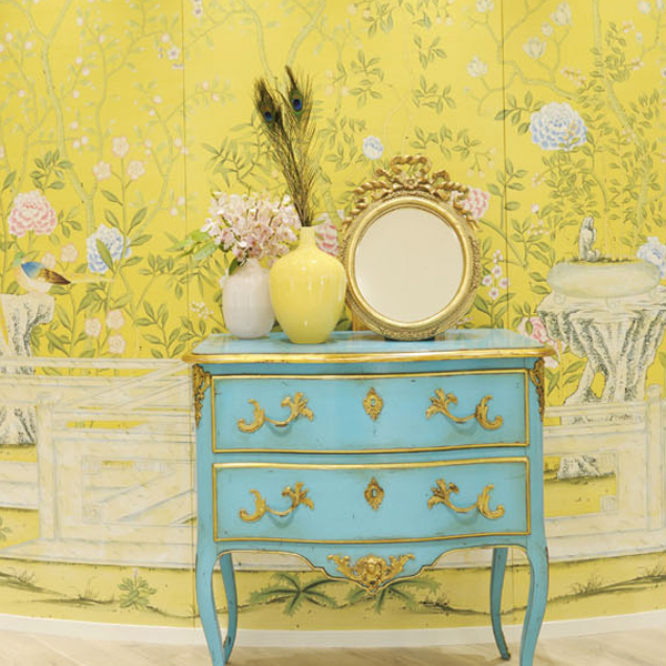
 Things that are well-made are almost always more expensive and worthwhile. Like absolutely everything from de Gournay.
 However, things that are beautiful, or chic, don’t always need to be expensive. Many people are conditioned to believe that if they get it at Target, it’s cheap or if it comes from Home Goods, it’s tacky. While this can be true, both of these stores offer some amazing finds if you know what you’re looking for. I wouldn’t buy my next sofa at a discount store as I already made that mistake and regret it every time I sit down on it. However, I’m redoing my bedroom on a really tight budget and my investment will be my mattress. I’ll be using a Thomas O’Brien for Target vintage modern bedding set mixed with the Nimbus Duvet cover from Anthropologie and have a gorgeous room I’m proud of.
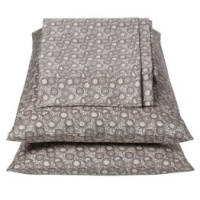
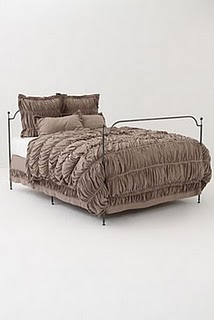 Neither are totally expensive, but both feel amazing and look great. So while I don’t always agree that you can outfit your complete home on the cheap, I strongly believe that you can make it completely chic within any sized budget.
All my best,
Melisa
Back to Main Site
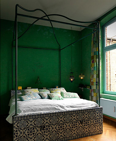
If I had to define my style as an interior designer, I’d say I’m eclectic. But what does that really mean? In my mind, eclectic design is a colorful mix of periods and styles with the unifying themes being comfort and interest. To me, an all white home cannot be eclectic, but others would disagree. I also don’t think bohemian and eclectic are interchangeable words or styles because a bohemian style feels very ethnic or very period – say, 1960’s or 70’s. However, an eclectic space will have touches of bohemian in it. It will also have industrial, traditional, modern, contemporary, and ethnic in the mix but it will rarely be minimalist, although I’m sure it’s possible to do an eclectic-minimalist home.
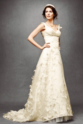
I don’t usually devote blog space to weddings or wedding-related wedding-ness but I am so excited to have come across some fabulous new stuff that I had to share it.