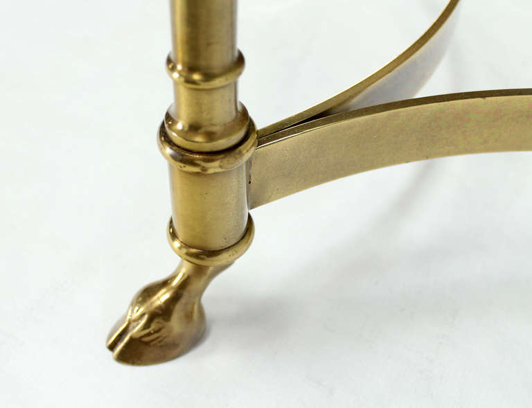
I have an obsession with animal-footed furnishings. I don’t even know when that started or why my world won’t be complete without them, but I know I need them in my life. Brass hooved and animal-footed pieces have been around for hundreds of years and have lived in the most luxurious homes – gracing castles, English country estates, and posh dining rooms the world over. In these very serious spaces they brought a touch of whimsy and mystery. In today’s homes, animal-footed furnishings play nicely with everything from traditional settings to ultra-modern surroundings.
Where Hope Has A Home – Update!
Each time I sit to down to write a post I am overwhelmed by all of the things that have happened since I last updated my blog. It’s apparent that I need to devote as much love to the blog as I do to my projects because it’s an awesome creative outlet that helps me connect with you in a way that my Facebook and Instagram posts cannot.
Having been chosen as a designer for the Where Hope Has a Home Project at the Ronald McDonald House Stanford, has been such a humbling and challenging experience. I am continually in awe of the design talent that has come together to make this very special building a beautiful, safe and comforting place for children and their families.
Catching Up With The Muses
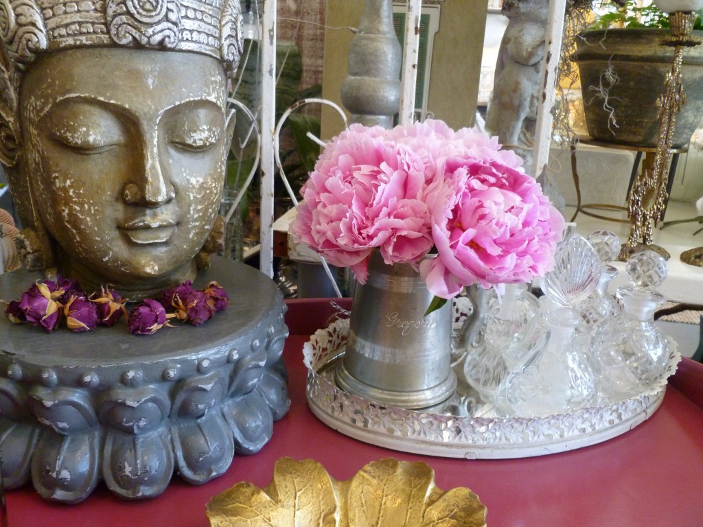 The past several months have been filled with blessings and challenges both personally and professionally and updating the blog has fallen woefully behind. Whereas I used to send out monthly newsletters keeping folks up-to-date on our wanderings, I’ve switched over to daily musings and updates via our Facebook page. If you haven’t already visited us there, we’d love to see you! I’m also really excited about my weekly columns on Houzz. Reader response has been fantastic and I’m getting to know so many amazing people through the sharing of design expertise and experiences. To read each week’s piece, make sure to check out Apartment 46’s idea books.
In May I finished a large garden project in the San Mateo hills, as well as worked on a complete renovation in Sunnyvale (ongoing), began the master bedroom of a Hayward Park home, put more touches on a San Francisco apartment, and did a few garden and home refreshes here and there throughout the Bay Area.
I’m still working on the Sunnyvale home, have started a second Hayward Park home, a Hillsdale home, and will be starting a San Jose garden project as well as a Hayward Park backyard. The San Mateo Hills garden project has been expanded to include more of the property so that’s happening this weekend and we have a Millbrae home on deck. It’s an understatement to say I’m blessed by the work because the clients I’ve been lucky enough to design for have been some of the kindest, funniest, and most interesting people I could have hoped to meet. I know there’s a definite design rule about crossing the client-to-friend border but it can’t be helped. The folks I know are just too damn awesome!
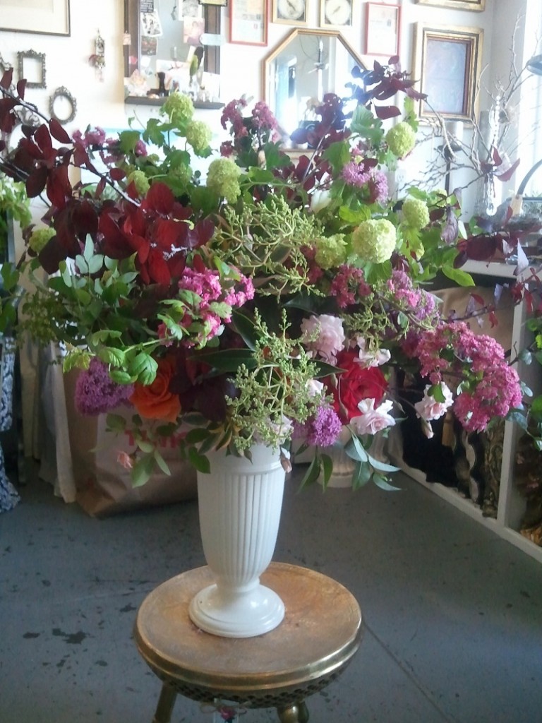
The shop is still doing custom floral and we’ve had the opportunity to do several super huge bouquets over the past couple of months. I really don’t believe that a house is a home without fresh flowers and greenery. Floral arrangements are something we’ll always offer because we feel it’s such an intrinsic part of making a space more lovely.
Our relationship with One Kings Lane is going strong and we’ve continued to sell unique vintage items in their weekly flash sales. If you haven’t already made an account, please click on the OKL banner on the right of our blog and make one. Registering through our page helps our small business and lets OKL where you heard of them. They never spam and they always have beautiful things on offer.
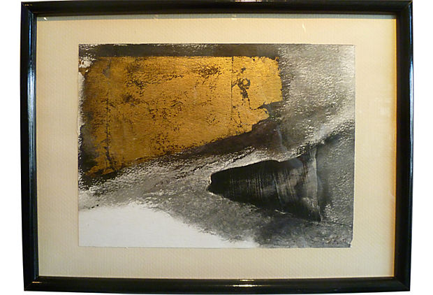
I’ve been really focused on vintage art and have so many great pieces in the shop at any given time it’s impossible to post them all. This 1970’s era black, white and gold abstract is currently for sale. Although it’s over 30 years old, it feels fresh and modern and would be gorgeous above a console, leaned against a larger piece on a mantel or even put in a guest bath as a point of interest. Every home needs “real” art and it doesn’t have to be something big and expensive to be meaningful. Art is a room-changer. Whether you’re into abstract, illustrative or oils, there are as many ways to add art to your space as there are artists. I personally think gallery walls are an exciting way to mix various smaller pieces to create an interesting tableau.
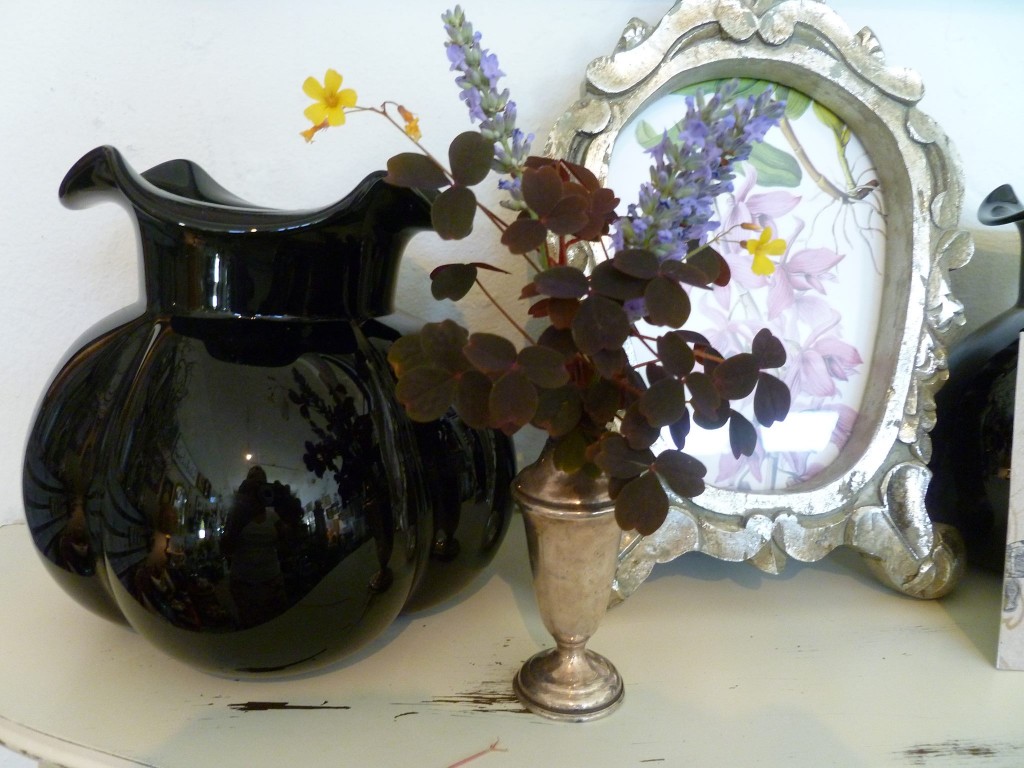
Sometimes the smallest accents make the biggest impact. Many times I’m hired to provide the finishing touches to homes that have all the basics — sofa, tables, television — but are missing the warmth. It’s so important that a home reflect the people who live there and I am thankful every day that I get to continue doing what I love most, which is adding beauty to Bay Area homes and gardens.
I’m hoping to post photos of my recently completed projects very soon and if you haven’t been by the shop in a while, you know we’d love to see you.
Much love,
Melisa
Back to Main Site
Baywood Residence
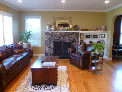
A San Mateo couple with a young daughter requested that I do a makeover on their space utilizing existing furnishings where possible. Art and accessories warmed up the space and gave the rooms a more finished look. Husband and wife have somewhat divergent styles, so finding a happy medium and incorporating family heirlooms was key to the project’s success. The rooms needed to welcoming, reflect who the couple is at this stage in their lives, and be able to withstand their energetic little girl.
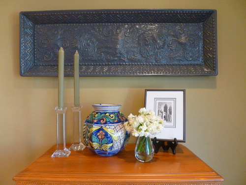
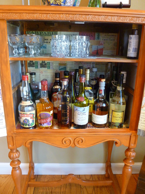
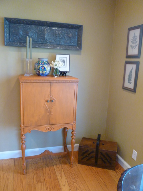 I painted an antique cabinet to use as a bar.
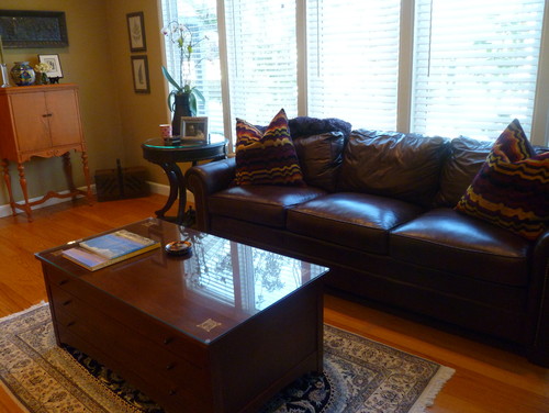
The leather sofa and chair, as well as the coffee table, were purchases the couple previously owned. The tables were topped in tempered glass with polished edges to stand up to the daughter’s toys and activities.
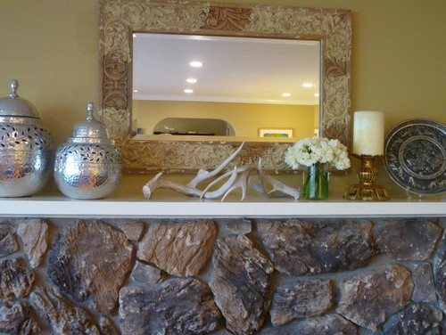
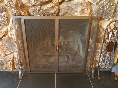
The fireplace will be re-surfaced eventually. The 70’s brass and iron mesh curtain was removed and an updated flush fireplace screen was put in its place.
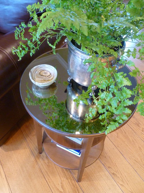
The side table was something the family already owned.A bronze mirror was cut for the top and it was stained darker.
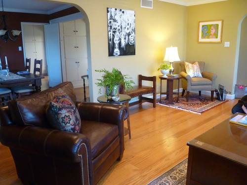
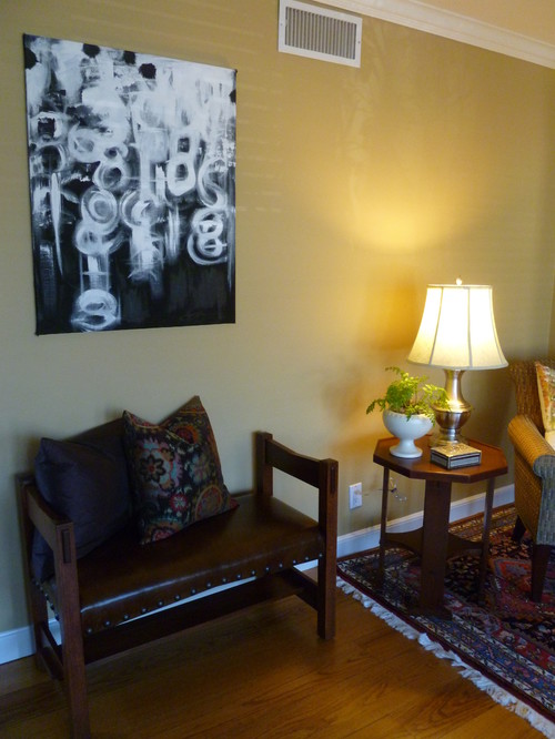
The leather-covered bench was placed against the wall to be used as optional seating for guests.
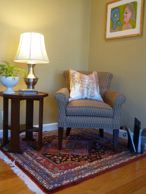
The family has a number of heirloom carpets. A smaller one was used to create a reading area within the larger living space.

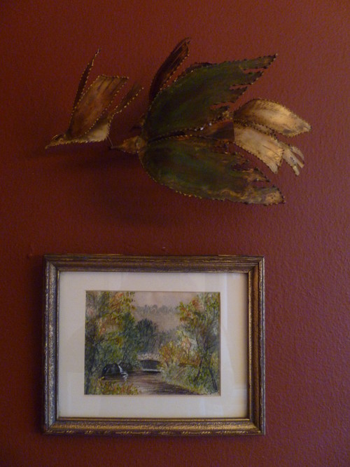
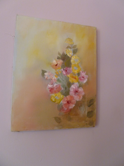
The addition of art will be an evolving process for the homeowners. A 1968 screen print titled Leili and Majnon was finished in a nondescript frame so it was gold-leafed and distressed to add more depth.
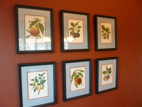
The grouping of vintage fruit prints is on the dining room wall. The room is still a work in progress – Above and below is a sneak peek.
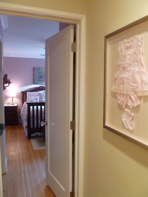
A handmade baby outfit from Puerto Rico was shadowboxed and hangs at the entrance to the daughter’s bedroom.
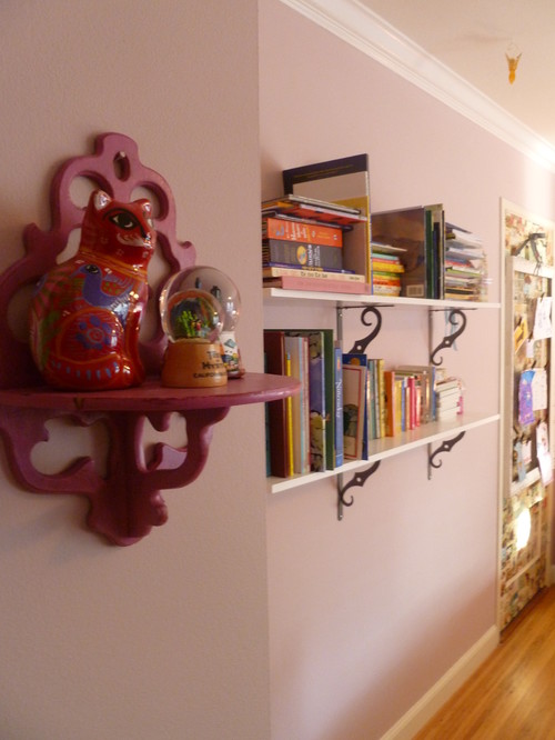
The vintage painted shelf in the daughter’s room allows her to display her ever-rotating treasures.
Vintage unframed art adorns one wall.
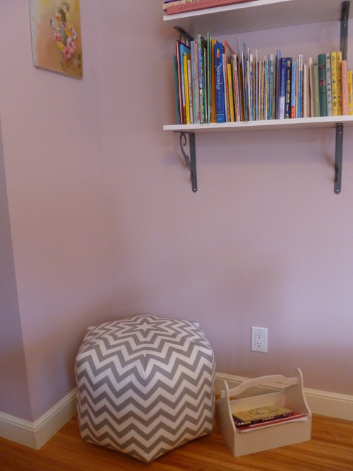
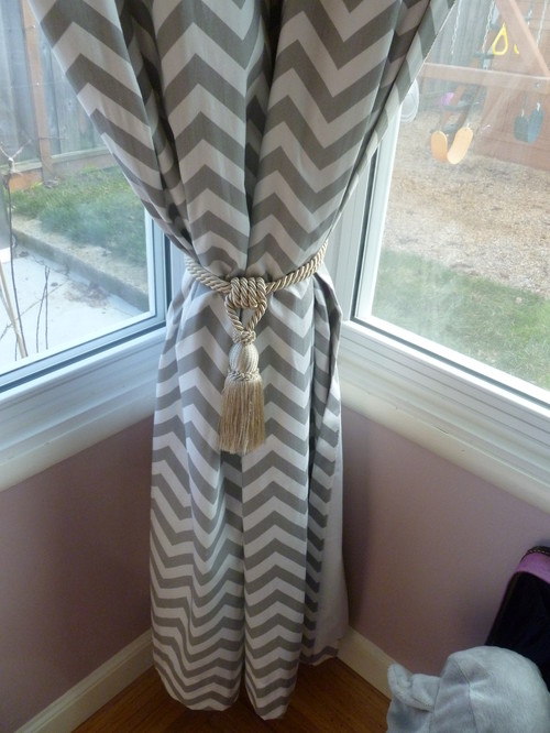
A pouf matches the custom draperies, and sits underneath two long shelves holding the daughter’s books. A bookcase would have taken up too much room on the floor, and the walls were a great use of space.
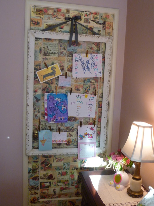
The layout of the room includes an extra door that is never used. It cannot be removed because of code so it was papered and hung with framed chicken wire that displays the daughter’s artwork with clothespins.
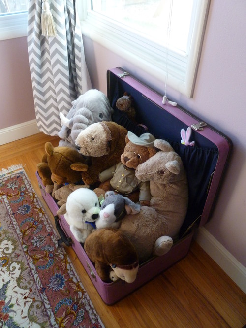
The stuffed animals occupy a painted vintage suitcase.
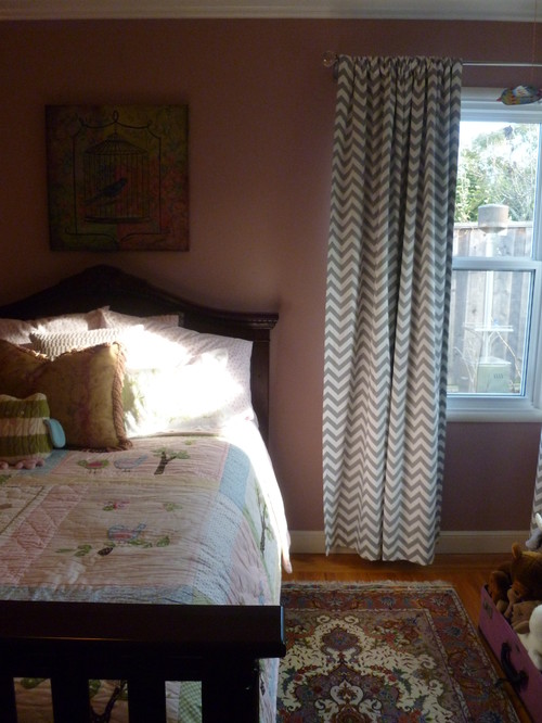
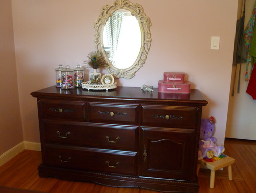
The bedroom furnishings were a present from the in-laws, the mirror is vintage.
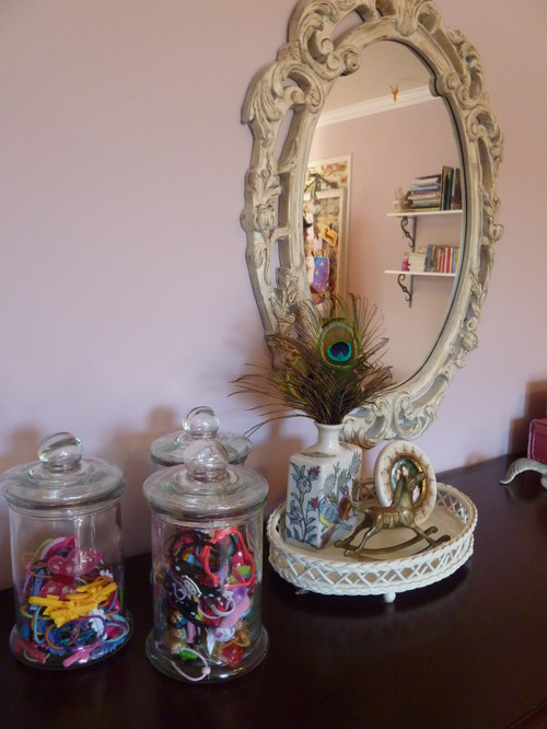
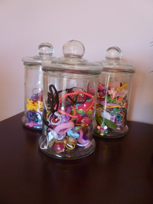
The antique pharmacy jars hold the daughter’s wide selection of hair clips, ties and accessories.
The Wonder of Wall Coverings
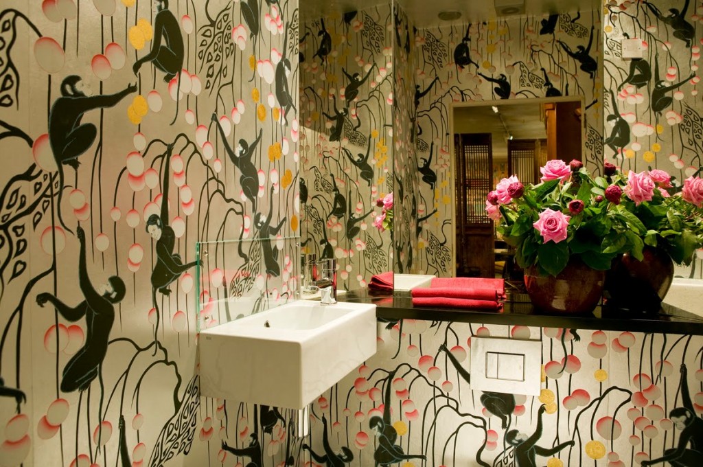
Let’s put it on the table straight away. I love wallpaper. Would I paper an entire house? Probably not. For one thing, the paper I covet is probably the most costly available, and for another, I am a renter, so I’m saving that indulgence for my very first home. It’s not for everyone, but the paper above? The monkeys? That’s definitely for me.
The first time I saw gorgeous, hand-painted wallpaper used in a design magazine, I had just started high school. Up until that point, my only exposure to wallpaper was what I had seen peeling off the dentist’s office walls and the hideous bright yellow floral that adorned my bedroom when my mom first bought the house.
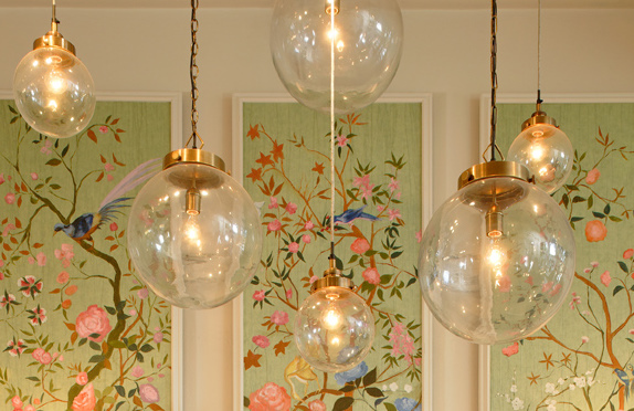
Nothing about the magazine photo stayed in my memory except the wall-coverings, which were a vibrant Chinoiserie scene that included flying birds, cherry blossoms, pagodas, butterflies and branches, and was painted on a soft silver background. It took my breath away. Furniture was inconsequential next to that art. I filed it away in my head with other beautiful things that have left their imprint on me. de Gournay hand-painted wallpaper is, to me, the epitome of luxury and timeless chic.
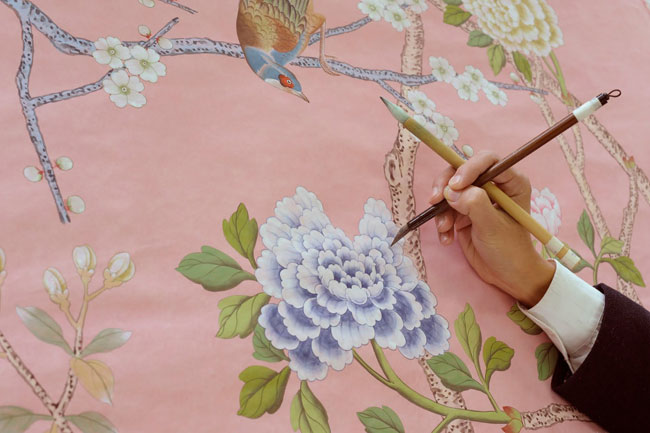
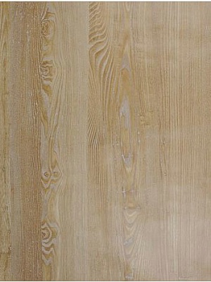
Walls are a very personal thing – both physically and metaphorically. The way you adorn (or not), the walls of your environment says volumes about who you are, and what you are about. While I love the look of great and eclectic art on bright, white walls, I also really, really love faux bois wallpaper and think that I would love to do an entire hallway in it. Nobilis does the most realistic I’ve ever seen.
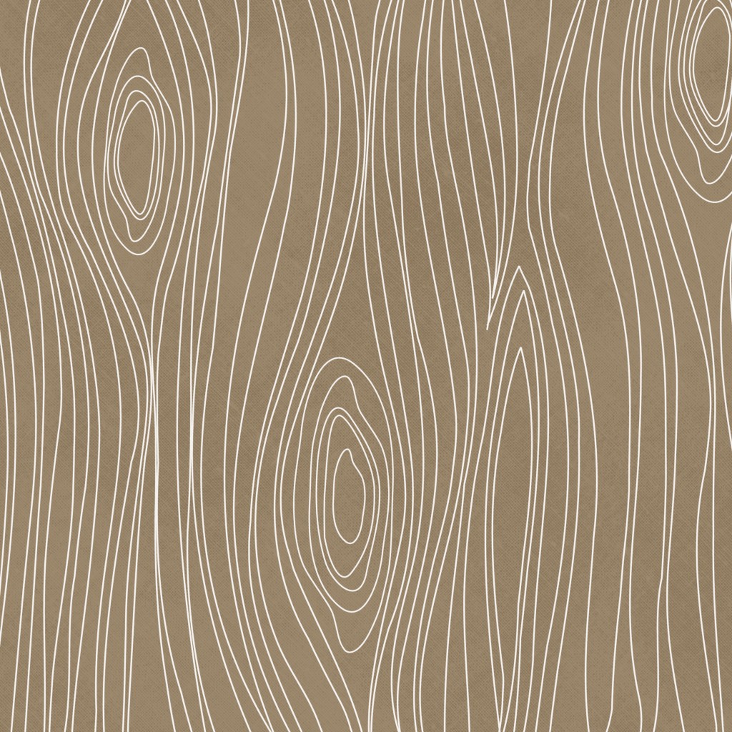
Then again, I also really like the more playful and topographic-map looking faux bois as it would look gorgeous in a modern, minimalist or contemporary home.
But here’s the thing, I am also obsessed with textured walls, and thus, organic wall-coverings. There was a time back in the 70’s and early 80’s when textured wall-coverings were pretty commonplace. I remember my mother painting over some textured brown grass cloth, turning it white, and I thought that wall was the coolest thing I had ever seen afterward! Texture creates a warm elegance that a flat wall just doesn’t have on its own. My favorite place to use texture is in an entryway. Grass cloth is perfect for creating an interesting, high-end and earthy-feeling space.
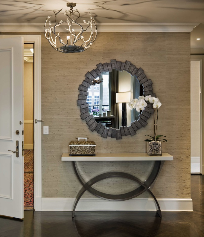
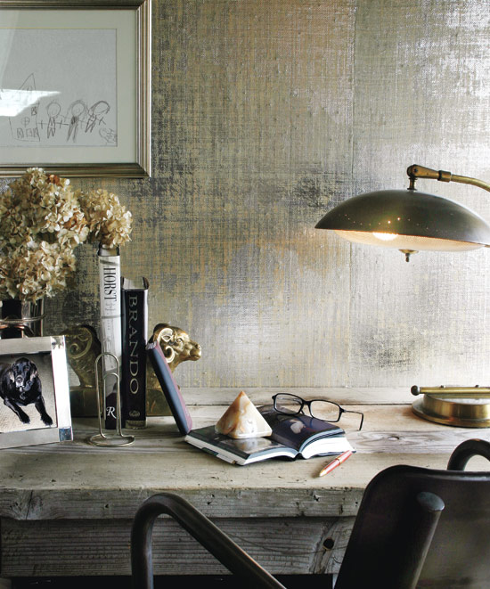
It can be really subtle, (or not) depending on the color and whether it’s metallic. There is nothing quite like metallic grasscloth. It’s absolutely stunning when mixed with masculine and industrial-style pieces.
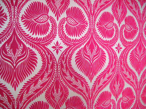
I have to admit I also have a little bit of a thing for pricess-style wallpaper. You know, the soft, fuzzy kind that Cinderella probably had when she moved into the castle? Yeah, I love that too. Design Your Wall has an awesome collection of flocked velvet wallpaper that makes me fall in love a little bit more every time I see it. The ultimate in textured paper, it definitely evokes a retro-brothel feel that I think would be so wicked in a small bathroom or a woman’s dressing room. It’s fun, unique and definitely over-the-top princessy.
If I were going to forgo wallpaper, I would probably opt for large-format art for my walls. I am completely smitten by the look of a single wall done in one giant, graphic image. Like a feature wall, but without the paint. I was digging through a pile of old design magazines and found a 2009 issue of Elle Decor UK, (now called Elle Decoration) and re-discovered Tektura, a UK-based company that turns digital photographs into large-scale vinyl wall coverings. Although it’s a 4-year old idea, it feels fresh to me, and I’m pretty sure I need it. In my future dream home, I will have them turn the below image of a fighter-pilot’s helmet into a floor-to-ceiling piece of art – and I will love it madly. I have carried this image with me for years, knowing that one day, it would be on the wall of my home.
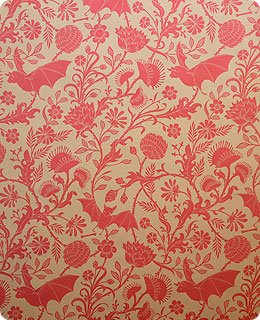
Seven years ago I learned about Flavor Paper in NYC and went a little bit mental ordering samples. I decided that there is definitely a project out there in the world that requires me to install their hand-screened Elysian Fields paper in a nursery, counseling office, or some other totally cheeky place. The black and purple colorway almost made its way onto the walls of my shop, but I am constantly nailing things to the walls and that wouldn’t be good for the paper.
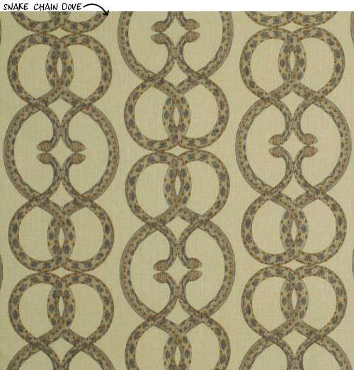
Just saying the word “wallpaper” used to bring to mind a grandmother’s house, or a stuffy, cold manor on a bog. Today’s bold patterns and modern colorways have given new life to wallpaper and a new opportunity to do something different and graphic in your space. Dwell Studio has a line of wallpaper that’s both modern and edgy. My heart beats a little stronger for their Snake Chain pattern, which looks like basic curled “S” shapes until you get up close. LOVE it.
I am going to be experimenting with some of Tempaper’s removable wallpaper in my dining area. For us renters, it’s kind of a dream come true! My dining space is very small, and very boring, and I’ve painted it more times than I care to admit and it still makes me sad. I’ll keep you posted on how it turns out and whether it was really “removable.”
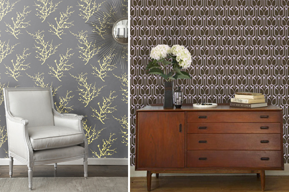
So next time you are thinking about refreshing your space, consider adding a bit of interest with wallpaper. Whether your style is conservative, traditional, playful, eclectic, or minimalist, there is a paper in this world for you. You just have to pick one you like and get it up on those walls!
Wishing you much inspiration,
Melisa
Back to Main Site
Kittredge Home
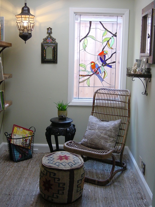 Pravina and Perry Kittredge are a well-traveled, well-educated, and super interesting couple with three young children. As a scientist, Pravina loves interesting objects and odd things. Perry, a middle-school math and social studies teacher, likes a relaxing and uncomplicated space that is both comfortable and functional. The challenge was to take on two previously unused spaces and turn them into something the family could enjoy.
We’re An Official One Kings Lane Affiliate!
We are so excited to announce that we’ve been approved as a One Kings Lane affiliate! We have been in love with OKL since the day it began and being able to offer their collection of products through our site is just another way of helping you create an amazing space.
If you’re already a fan, all you have to do is click the banner on the home page of our site and book mark the link and there you go! Each time you log on through the bookmarked link, you’ll be supporting small business as zero extra cost to you. How awesome is that?
If you’ve never been to OKL, then get ready for a double-helping of “yes please!” You’ll wonder why it’s taken you so long. You can join the site directly from my home page. Click the banner, create an account and voila! You’re a super star!
We have some other fantastic things cooking with OKL so we’ll keep you posted. Until then, thank you for loving us as much as we love you.
Melisa
Bringing Back the Bar
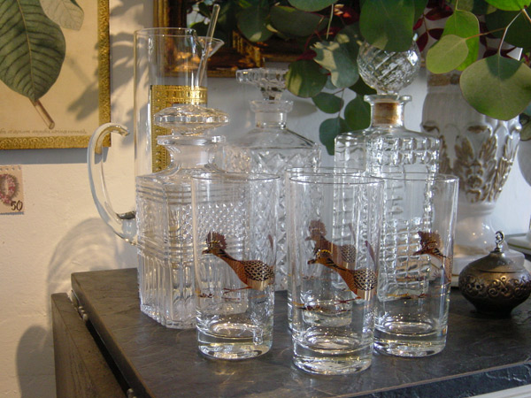
The 50’s and 60’s are amazing examples of entertaining done right. Details mattered, inviting people over was always a big deal, and even casual after work drinks were served in decorative highballs. What drink doesn’t taste better in a fancy glass?
No Room Left Behind!
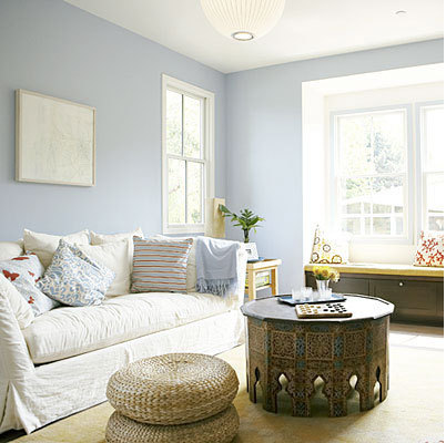
Long ago I read Karen Kingston’s enlightening book, “Creating Sacred Space With Feng Shui,” and much of what I read has become a building block for how I work with my clients to define their current and future space. When it comes to clutter, Kingston’s belief is that we are tied to everything in our home by invisible strings of energy.
From F**ked to Fabulous
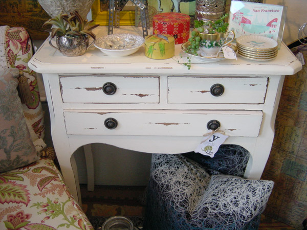
I heart previously loved furniture and objects that had a life previous to Apartment 46. I am attracted to things with a soul. The idea of returning something to its “original” condition bothers me.

