There Are Great Things In The Works!

20140928_173907
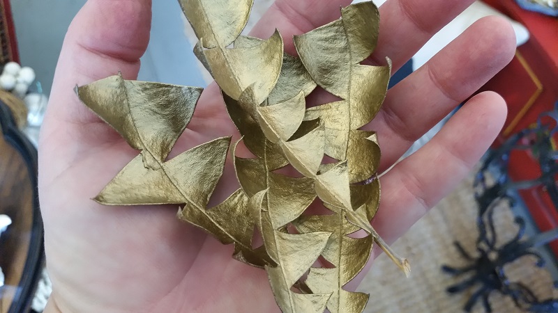
Gilded Protea Leaves

So I’ve been doing some soul-searching and I’ve decided I’m finally ready to tackle a TOTAL renovation of my blog. It’s been sitting here sadly waiting for quite some time and I feel like I know where I want to go with this. Writing two weekly columns for Houzz has been amazing and I’ve met so many fantastic people through my involvement with the site but I have to admit, I’ve let my own little blog kind of languish. I’m sorry for that. I regularly post missives on our shop Facebook page so you can always keep up to date with our day-to-day there, and I’m probably far too active on Instagram where I post the things that inspire me. All of this is happening, and yet, I go to sleep each night filled with stuff I want to write about and share with you. So I’m getting re-focused and will be reworking the blog over the next couple of months.

IMG_20141010_233655
#Designcat isn’t really helping.

Since I somehow got myself on the WordPress.org platform instead of normal-people WordPress, I’ve found that I am unable to apply any new template or format. The theory is that I should be intelligent enough to code my own template on WordPress.org which is never gonna happen so…Wish me luck with this while I work on the new blog in parallel to trying to keep y’all updated on this blog. You know there will be a lot of coffee and swearing happening up in here as currently it’s is all me and I am many things but graphic designer/tech brillianaire is not one of them.
IMG_20141007_140754
Our last meal at Kohler happened here.

Many of you know I was recently invited by Kohler to visit their phenomenal resort, The American Club spend time in their design centre, drool over their gorgeous offices (The Beacon), and tour the factory. I promise I’ll expand on that visit in my next post because really, it was incredible and I want to go back. The most important thing I took away with me from that visit was getting to meet and connect with several really fantastic, intelligent and creative women in design and photography.

IMG_20141007_141517
Nicole Cohen of Sketch42blog and Paloma Contreras of La Dolce Vita blog.

If you haven’t checked out Sketch42 or La Dolce Vita, hurry UP! There is so much to see and experience on both sites and the women behind them are awesome human beings. You know me, it takes me a while to warm up to folks and being the always-wary girl I am, I wear my trust issues on my sleeve. These girls are the real deal and I’m blessed to have crossed paths with them.
20140928_173821
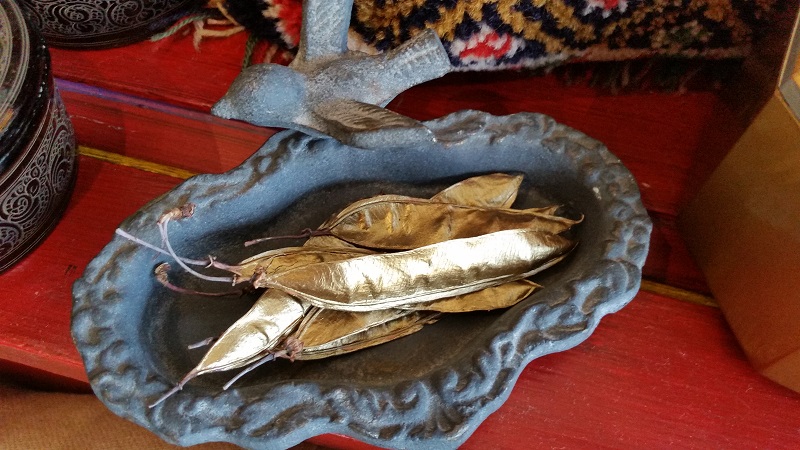
Gilded bean pods

As usual I’ve been in the shop creating because that’s how my mind works. When I’m stressed, excited, happy, sad, or breathing (which is always thankfully), I’m creating. Sometimes I get stuck in my own head and it’s hard to come back to reality. I’ve been making loads of curious things with what nature has provided me and I can’t wait for you to stop in the shop and see what’s been going on.
IMG_20141009_181135
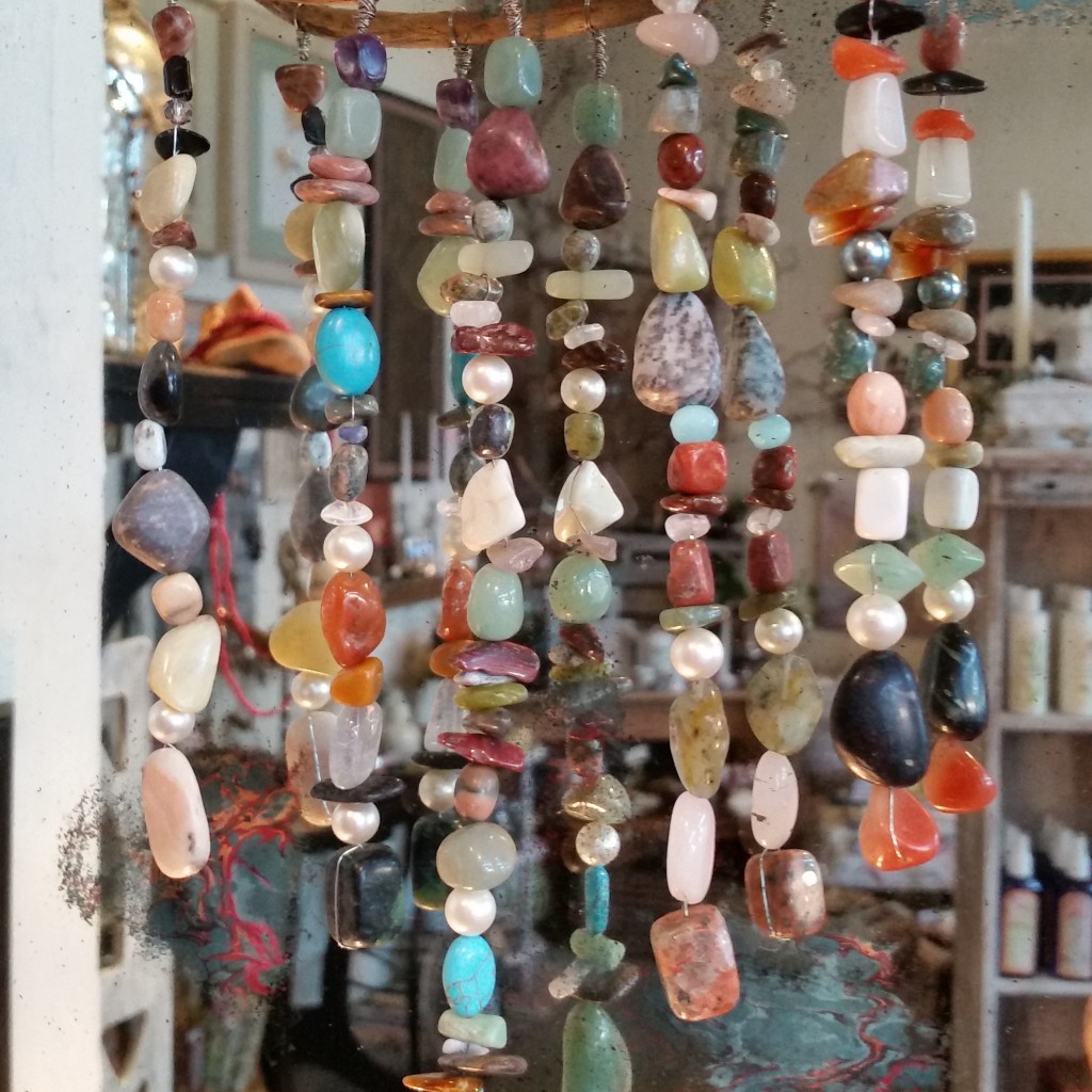
Semi-precious stones hung on a piece of dried kelp.

Be patient with me while I revamp this little sugar-shack of a blog I have and hopefully I’ll do you all proud. In the meantime, go forth and get creative, it’s good for your soul. 🙂

candle-birdbath-0710-l

Much love,

Melisa

Back to Main Site


DIY Ideas from a Sleepless Mind – Drink Tables


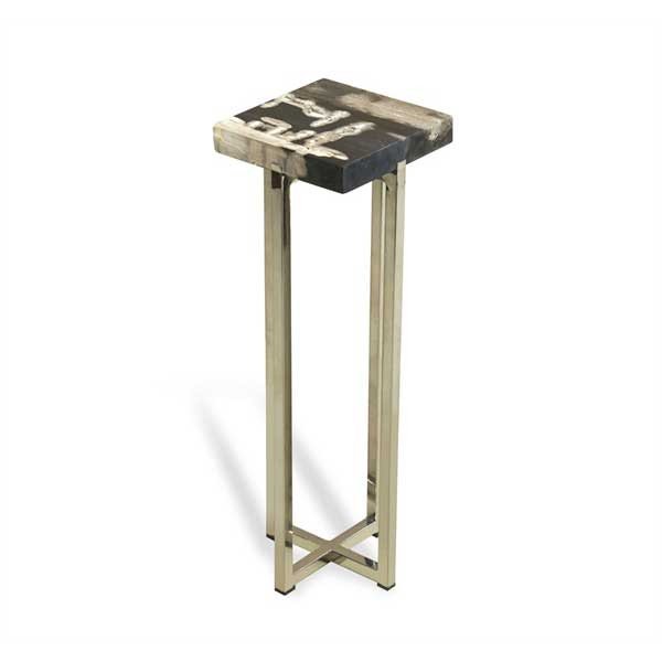
IH-155040I am in love with this little table – the price, not so much. It’s called the “Argo” and it costs anywhere from $350-$550 depending on where you look. It’s a drink table and as the name implies, it gives you space to set a drink or two. I am obsessed with drink tables, and I think they have a place in every home, however I don’t think they need to be $500.

Anyway, for the past two weeks I have had  the “creative crazies”. I have a ton spastic energy and far too many ideas. I have also been on a mad purge, going through all of my design files and magazines in an attempt to distill it down to what inspires me most. Take last night for instance, I was sitting on the couch enthralled by a renovations episode on HGTV when I was suddenly compelled to create my own mirror-topped drink table.


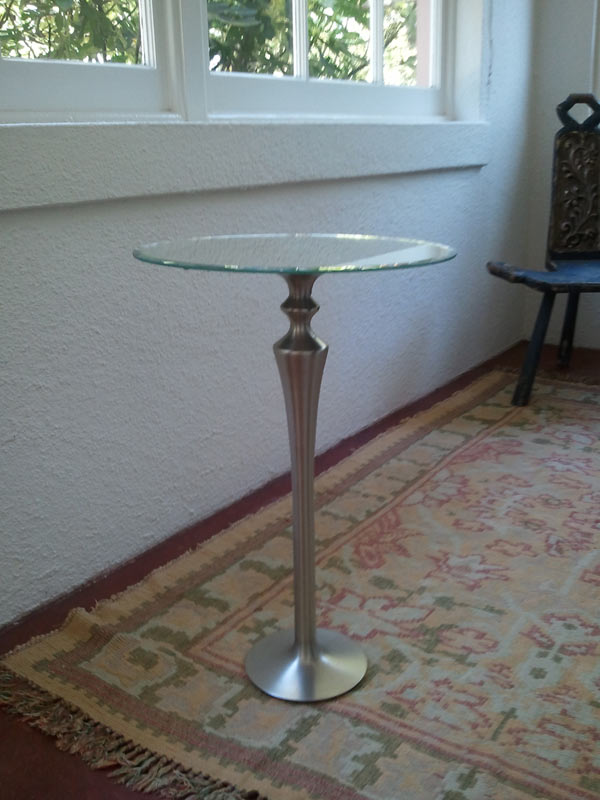
I used a brushed nickel floor candle holder and a mirrored tray. The candle holder had been on my fireplace hearth for over a year and the tray was happily living at our shop, Apartment 46.

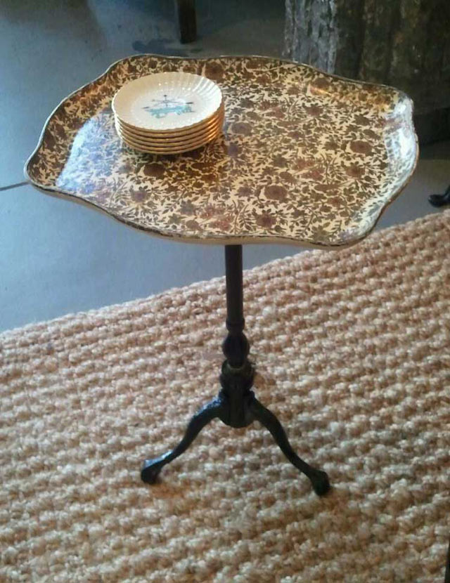
I literally got in my car and drove to my store in the middle of the night because I was obsessed with my own idea. Both items were then combined with a healthy dose of epoxy and are now celebrating their new incarnation as a drink table in someone else’s living room, (because I was talked into selling it). I loved my own idea so much I repeated it with a vintage brass table base and a papier mache Italian tray.

The old design adage is that for every chair there should be a place to easily put your drink – and I love that. A coffee table is great if you can reach it from every seat in the room but that’s not often the case. You don’t need to have a large side table to place a glass on, you need a candle base or an old table base and a sturdy tray!

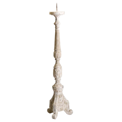
Large Old World Floor Candle Holder_400-01If you want to use a candle holder as your table base, be sure it’s a floor candle holder. You want it to be tall enough to be useful. Also, ensure that it has a weighty, sturdy bottom to balance out any top-heaviness of a tray plus drinks. This stone floor candle holder is definitely weighty enough, and the spike can be removed. Many tall candle holders have a metal spike in the center to hold a candle steady. These can be broken off with a solid pair of pliers or nail/bolt cutters. Sometimes they come off easily, sometimes it’s a bit of a struggle so be careful! If you end up taking a chunk out of the candle holder that’s okay. Your tray will cover it.

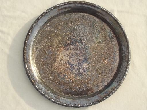
vintage-silver-plate-lot-of-round-trays-for-buffet-plates-or-serving-Laurel-Leaf-Farm-item-no-u102915-4

I love the idea of tarnished silver trays as drink tables. There is something soulful and bittersweet about old silver and it’s fantastic when utilized in an unexpected way. Metal trays are also a great counterpoint to a wood or stone base.

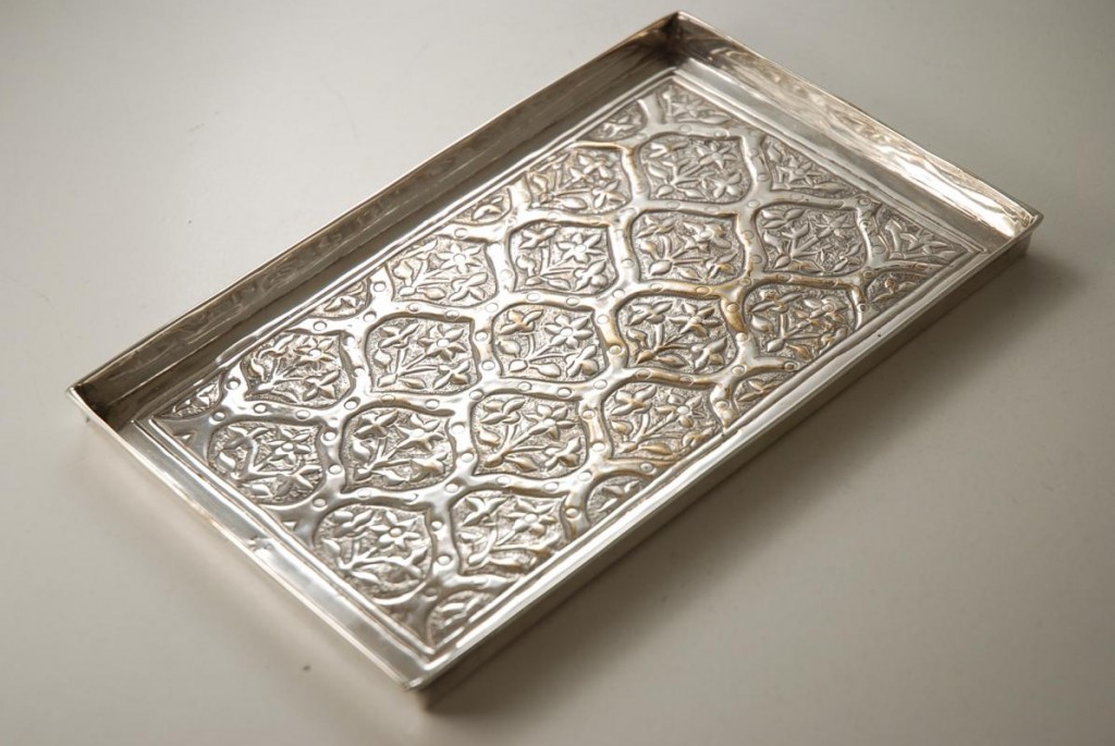
Arts_and_Crafts_Silver_Plated_Tray_by_Keswick_School_of_Industrial_Arts-00

Don’t feel you have to stick to round when it comes to the tabletop shape. You can use a rectangular or oval tray and create something unique and fabulous. The Italian tray I used was an exaggerated rectangle. The antique sterling tray above would be beautiful as a drink table and it would likely get much more use and admiration than if it were sitting on a shelf somewhere. I am always trying to find a way to re-purpose vintage items in fresh new ways. For me, it’s all about giving something new life in today’s world and drink tables are versatile and super convenient for space-constrained homes.

611d835f-f3b9-4ccd-b552-bc7b15c559dc_400

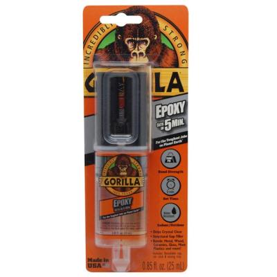
Lately I’ve been super into two-part epoxy because it holds incredibly well and is relatively easy to apply. You take off the tip and squeeze it onto a piece of cardboard or heavy duty paper and kind of mix it up and apply it. I use a paint mixing stick to smear it onto the flush part of the candle holder because it’s thick and messy. I also apply it to the bottom center of the tray I’ve chosen.

Use a generous amount and wipe off whatever seeps out once the tray and base have been connected. I like to turn my pieces upside down to cure because the weight of the bottom piece gives it a tighter seal. You could also put something heavy in the center of the tray but it may fall off or fall over. I learned the hard way that upside down works best for me.

Epoxy creates strong fumes so I recommend applying it outdoors and letting it cure before bringing your piece inside. I checked my tables after a couple hours just to be sure the tray top hadn’t shifted and brought them in fully cured the next morning.

If you end up making a drink table of your own please send me pics! I’d love to see your creations.

Happy Making!
Melisa

Back to Main Site

Creating A Sacred Space


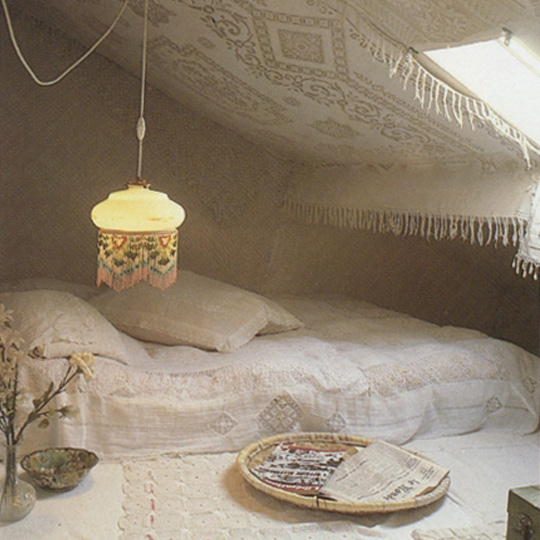
Crochet-White-Room
Image courtesy of The Trinkit Hunter

Your home is where the shared space of the world ends and your private sanctuary begins. What could be more sacred than the space in which you begin and end each day? Creating a peaceful environment that honors what you love and who you are, isn’t really about four walls and some furniture. 

267460_10151192410913738_1799482933_n
Tara Bliss – image courtesy of Hibiscus Moon

Whether it’s family photos, glittering crystals, or a bowl full of shells you’ve collected, you add to spirit and love to a place by adorning it with beautiful and meaningful things. The word “sacred” means different things to different people but I use the word to mean highly valued and important : deserving great respect.

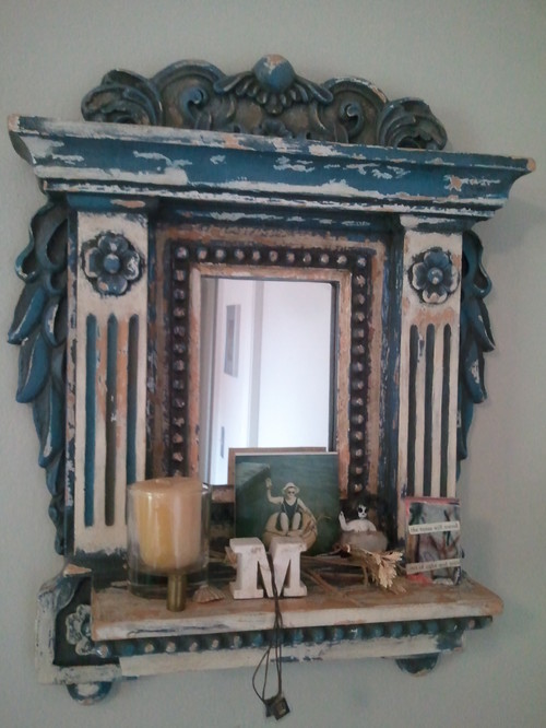
You don’t need a large area to create a sacred space. If you have is a shelf on a wall, you can turn it into a Blessings altar by adding to it tiny things you are thankful for, remind you of happy times or people you love. Sacred does not have to mean religious, although you may include religious icons if that is important to you.

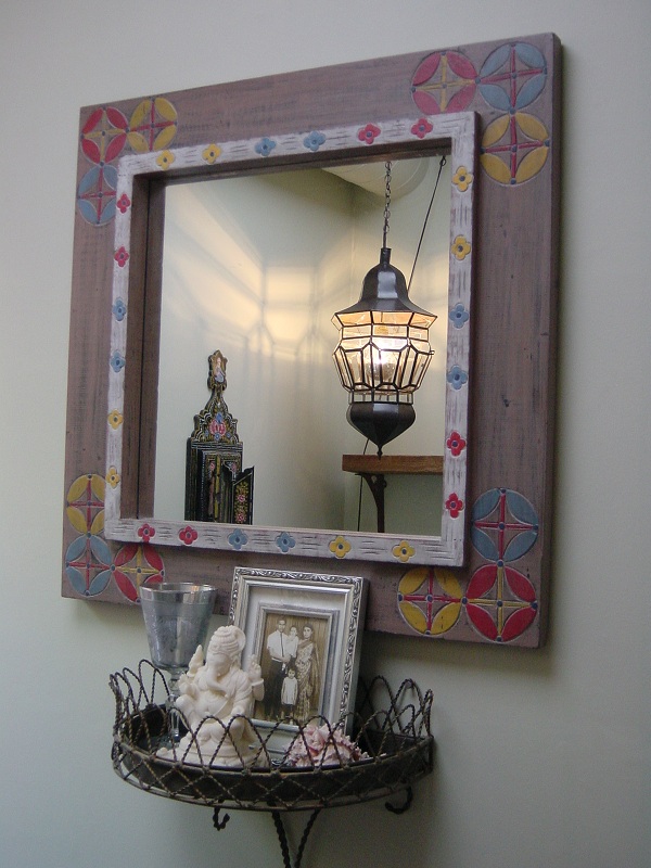
DSC00010In a 6 x 5 foot reading nook, I created this wall altar for a client as a private way to honor her Indian heritage. When she settles into the chair to read, she often lights the candle and uses those few seconds to think about her family. Those thoughts keep her close to important people in her life and give the nook a feeling of serenity.

10268719_711869852189028_152117193273652045_n
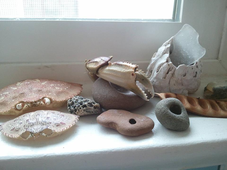
Kitchen Windowsill

In my own home I have several vignettes that are ever-changing. None take up much space and all provide touch points that remind me of moments, places, people and the general beauty of the natural world. My kitchen windowsill is an unexpected place to put special objects, but I stand there multiple times a day to use the sink and am always looking at what’s there. Right now I have a small collection of things brought back from my favorite beach – a place that holds everything my heart has ever felt.

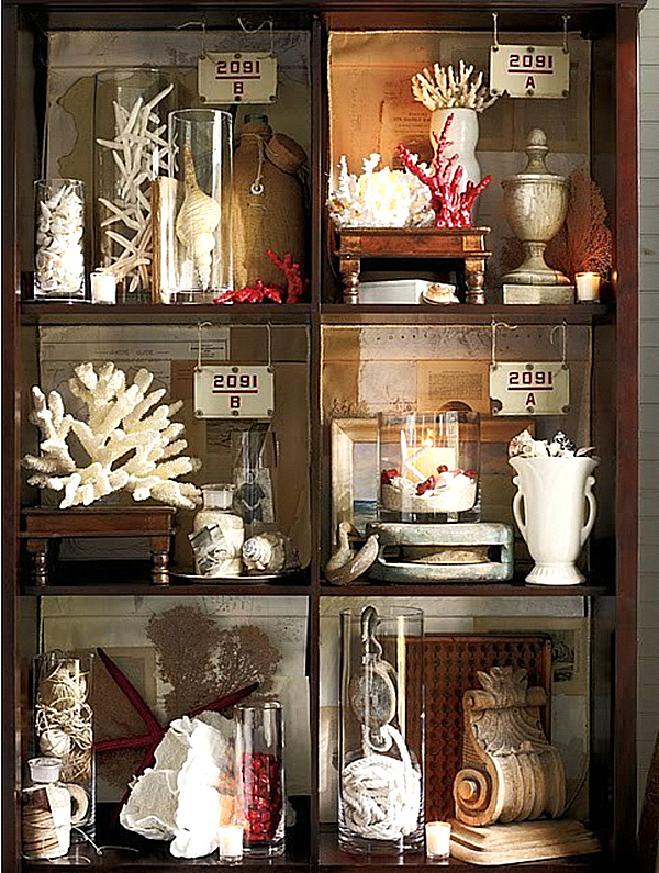
curiosity-cabinet-with-faux-coral.pngCreating a cabinet of beautiful things is also a great way to add a sense of sanctity to a room. All together it looks like a piece of art but when you stand in front of it and really see the individual objects, it becomes almost meditative. Noticing each and every thing takes time, and if all of the items have meaning, you can’t help but feel their importance.

e2b96552d09d94f89f4c10f50a5a174f
Image courtesy of decordemon


Setting aside a small corner of a room where you sit quietly reading, taking in the sunshine and letting the day slip away doesn’t require fancy decor or objects of spiritual significance. The sense of calm, warmth and safety you feel when snuggled under a warm blanket flipping through a magazine can be sacred in the sense that it refreshes you, centers you and removes you from daily stress. That is a space worth creating!

All my best,
Melisa

Back to Main Site

Dark and Stormy Decor

tumblrm5xvx5HmwG1qazgvfo1500
Image courtesy of Indulgy

I would describe my personal design style as being a bit dark and stormy. While I can appreciate things like country cottage and shabby chic, the sweetness of it isn’t something I naturally gravitate toward. Whether a room is traditional, contemporary or completely eclectic, I’m always looking for a bit of strangeness, something that can counter-balance the perfection. To me, dark and stormy style is all about finding that thing that makes a room edgy, interesting, and mysterious. It’s a room with a sexiness that makes you feel sexy by being in it. It doesn’t have to be a Goth-themed space. I’m not talking about darkness in the context of death and scary monsters, I’m talking about darkness that evokes a naughtiness, curiosity or steaminess.

Continue Reading

Sparkle and Shine! Easy Bling For Your Holiday Home

crystal-drops-on-a-christmas-tree
Courtesy of prsarahevans

It’s hard for me to believe that in ten short days Christmas will be upon us. By now, you’re probably done decorating, but if you’re like me, you just keep decorating until the holidays are over – and they’re not over for me until New Year’s Day. So if you’re really done (is that even possible?), then I hope this post inspires next year’s decor. However, if you’re hosting a holiday shindig, or feel like you’re lacking a little sparkle and intrigue, read on for tips on how to bring a little extra bling to your Christmas or New Year’s surroundings.

Continue Reading

Creating Fabulous Fall Vignettes

CLX1006Pum012_de For so many reasons, Fall is my favorite time of year. Although we don’t really have an extreme change of seasons here in California, there’s a chill in the air, leaves on the ground and families come together to share love, laughs, and warmth. In my opinion it’s also the best ever when it comes to seasonal decor! I’m always looking for unexpected ways to evoke the feeling of Fall without going all thematic with it. You’ll never find a turkey or Pilgrim in my house but you’ll probably find a whole mess of twigs, branches and fantastic gourds in vintage urns, bowls and baskets.

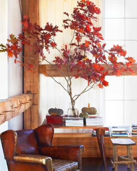
wonderful-fall-decor-with-branches-1When it comes to creating gorgeous seasonal vignettes the first place you need to look for inspiration is outside your front door. Fallen branches are my go-to every year for Fall decor because they’re perfect for bringing the outside in. It’s really windy where I live and branches are all over the ground most of the time. If you like a little more bling and a little less rustic, you can spray paint the branches gold. It’s a great metallic to mix with the oranges, browns and yellows of the season.

large bunch of branches in a vaseWhether they’re blooming, studded with acorns, flame-colored leaves or bare as can be, branches add dramatic elegance. When used in a simple vase, their height and shape are all that’s needed to make a statement.

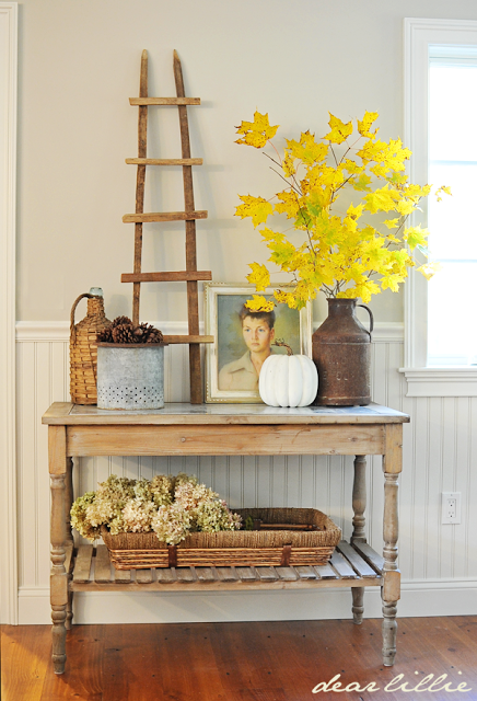
cOctober_228I’m in love with the spare simplicity of this beautiful vignette. Pulling together objects you already own and displaying them in a different way is a great way to start. You can get this chic and welcoming look by arranging a grouping that includes a rattan basket filled with dried hydrangea, metal containers, a branch or two, an old black and white portrait or an offbeat oil and the single white pumpkin. It’s welcoming and interesting and can be changed up so easily by adding elements such as pine cones, or gold objects.

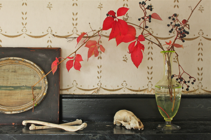
creeperI was late in getting this post up but I adore this vignette. Something about the tiny bones, art and single spray vine says just enough to let you know it’s Halloween without having to try hard. I think it’s mysterious as well as melancholy. I’m always looking for beautiful natural objects to add to the mix. Found animal skulls, empty bird nests, naturally shed antlers..all of these things say “change of seasons” to me and I love the grace of things we don’t usually see, touch or understand.

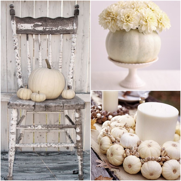
white-pumpkin-decorations-1I am ALL about white pumpkins. Stacked, grouped, piled in a basket, I think they’re absolutely stunning on a Fall mantel or used as a table centerpiece. They can be romantic when mixed with dried flowers, weathered architectural finds or mercury glass. Carve a white pumpkin and use it as a vase. Mix store bought nuts still in their shells such as almonds, pistachios, and walnuts with mini white pumpkins to add the sense of Fall in an unexpected way.

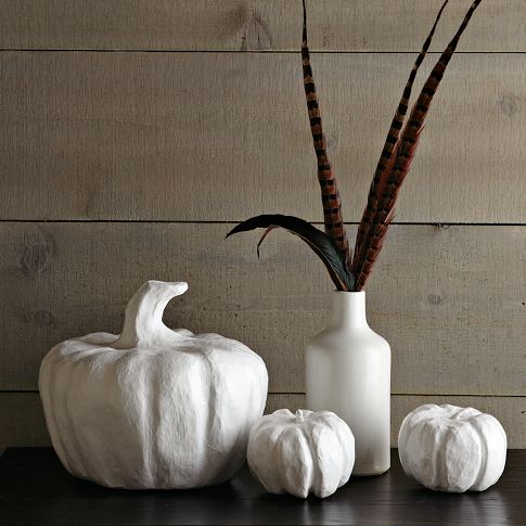
2c861a7f70cc7657_img43bI’m also a fool for feathers! Pheasant, Crow, spotted Chicken…When grouped loosely in a vintage container they can totally change the feel of a vignette. By themselves, the papier mache white pumpkins allude to Halloween, but adding pheasant feathers to a modern white vase is decidedly Thanksgiving. Again, it’s the simplicity of the grouping that makes me smile. So much can be said without having to be over-the-top with your displays.

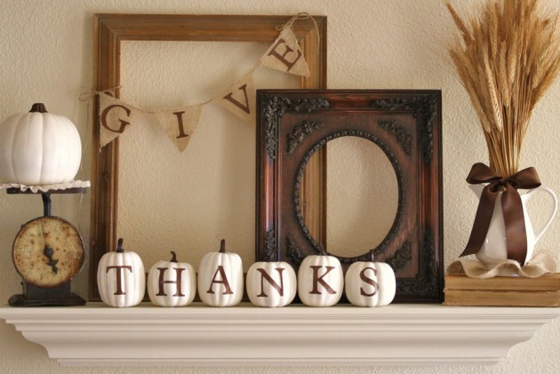
A-diamond-in-the-stuff-630x421 For a little more traditional Fall display, you can add vinyl transfer letter to small gourds, pumpkins, burlap garlands or even vintage clock faces and spell out phrases and welcome guests. Empty frames layered on top of one another is an awesome way to add depth. Look for worn, chipped frames with age and patina and add in a few rustic objects to finish off the vignette.

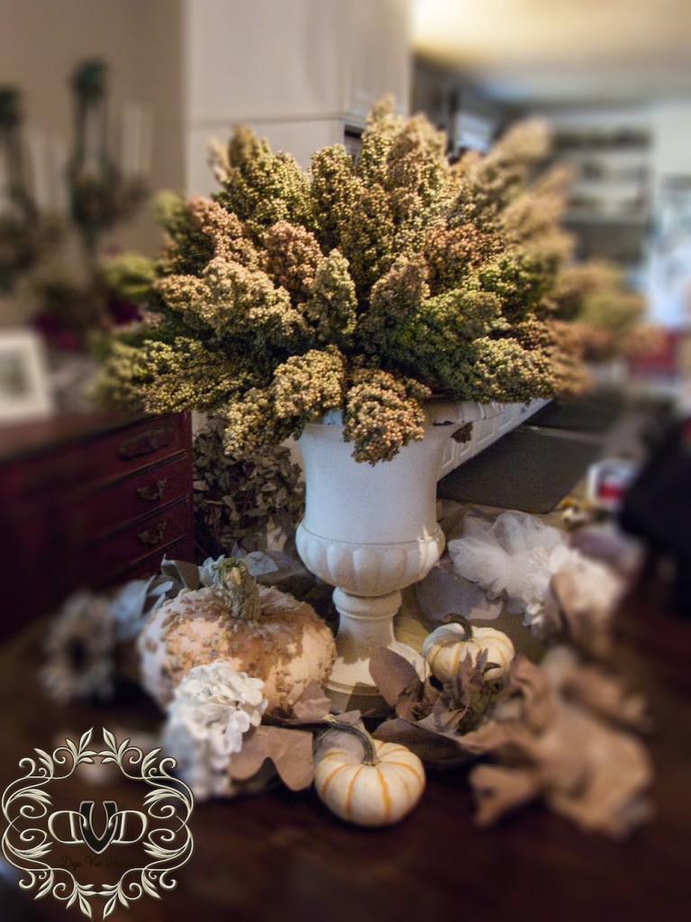
fall-vignette-copyMilk glass is always perfect for any vignette but filled with dried wheat, grasses, or millet, as shown above, makes a perfect Fall addition. The great thing about dried elements is that you don’t have to worry about soil or water. A collection of smaller objects surrounding a milk glass urn such as dried leaves, small gourds, dried flowers and even seashells would speak to Fall warmth and wonder.

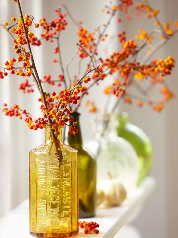
autumn-inspired-bottle-vignettesEven something as easy as a grouping of vintage glass bottles in autumn colors becomes a pretty little vignette when you add delicate branches of bitter orange.

Big-Indian-by-Percy-and-Tara-kitchen_02You definitely don’t need a lot of objects to make an impact and add beauty to your space. Think creatively, forage outdoors for found objects and make sure to use things that inspire you. Use color and shape to guide you – warm tones and soft curves – and play with different groupings until it feels right to you.

All the best,
Melisa

Back to Main Site


Catching Up With The Muses

P1030247The past several months have been filled with blessings and challenges both personally and professionally and updating the blog has fallen woefully behind. Whereas I used to send out monthly newsletters keeping folks up-to-date on our wanderings, I’ve switched over to daily musings and updates via our Facebook page. If you haven’t already visited us there, we’d love to see you! I’m also really excited about my weekly columns on Houzz. Reader response has been fantastic and I’m getting to know so many amazing people through the sharing of design expertise and experiences. To read each week’s piece, make sure to check out Apartment 46’s idea books.

In May I finished a large garden project in the San Mateo hills, as well as worked on a complete renovation in Sunnyvale (ongoing), began the master bedroom of a Hayward Park home, put more touches on a San Francisco apartment, and did a few garden and home refreshes here and there throughout the Bay Area.

I’m still working on the Sunnyvale home, have started a second Hayward Park home, a Hillsdale home, and will be starting a San Jose garden project as well as a Hayward Park backyard. The San Mateo Hills garden project has been expanded to include more of the property so that’s happening this weekend and we have a Millbrae home on deck. It’s an understatement to say I’m blessed by the work because the clients I’ve been lucky enough to design for have been some of the kindest, funniest, and most interesting people I could have hoped to meet. I know there’s a definite design rule about crossing the client-to-friend border but it can’t be helped. The folks I know are just too damn awesome!

SAMSUNG

The shop is still doing custom floral and we’ve had the opportunity to do several super huge bouquets over the past couple of months. I really don’t believe that a house is a home without fresh flowers and greenery.  Floral arrangements are something we’ll always offer because we feel it’s such an intrinsic part of making a space more lovely.

Our relationship with One Kings Lane is going strong and we’ve continued to sell unique vintage items in their weekly flash sales. If you haven’t already made an account, please click on the OKL banner on the right of our blog and make one. Registering through our page helps our small business and lets OKL where you heard of them. They never spam and they always have beautiful things on offer.

vmf_vendor_CHV_1145204_1359157379530_134

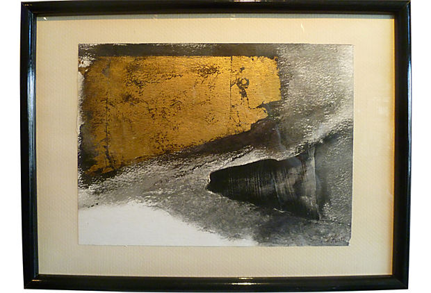
I’ve been really focused on vintage art and have so many great pieces in the shop at any given time it’s impossible to post them all. This 1970’s era black, white and gold abstract is currently for sale. Although it’s over 30 years old, it feels fresh and modern and would be gorgeous above a console, leaned against a larger piece on a mantel or even put in a guest bath as a point of interest. Every home needs “real” art and it doesn’t have to be something big and expensive to be meaningful. Art is a room-changer. Whether you’re into abstract, illustrative or oils, there are as many ways to add art to your space as there are artists. I personally think gallery walls are an exciting way to mix various smaller pieces to create an interesting tableau.

979858_557638447612170_1033291477_o
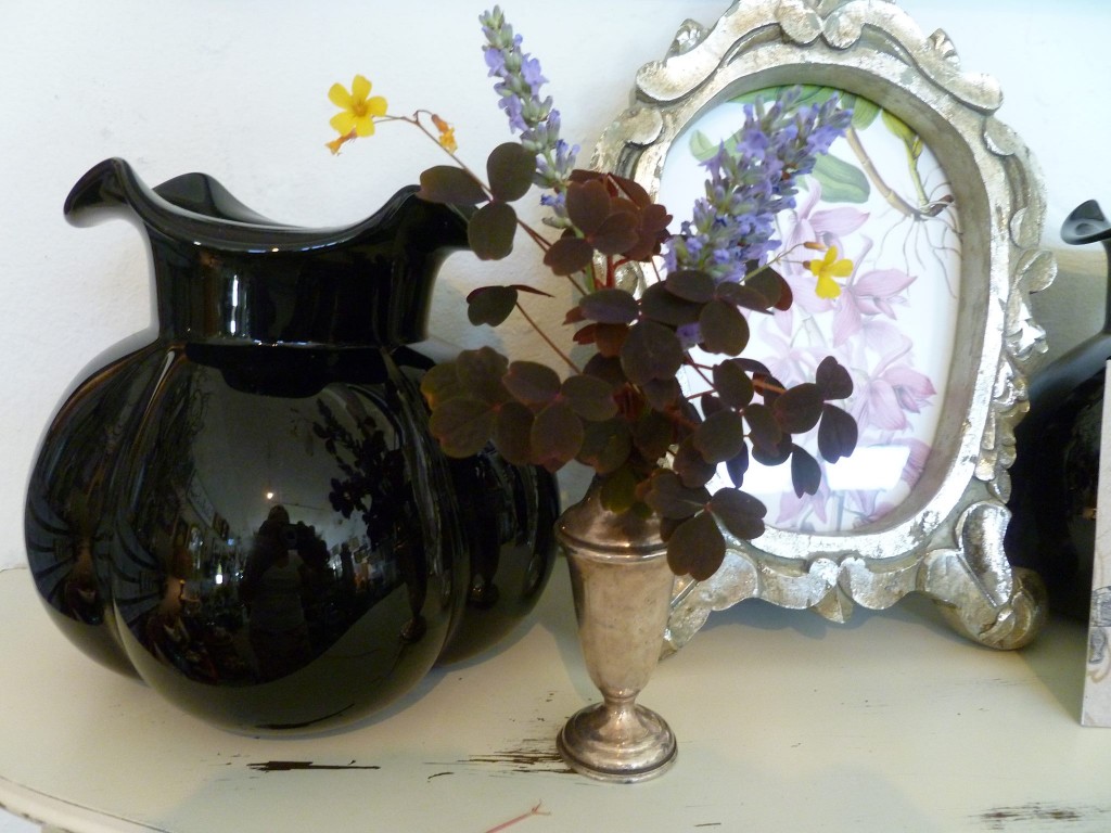
Vintage Japanese glass vase

Sometimes the smallest accents make the biggest impact. Many times I’m hired to provide the finishing touches to homes that have all the basics — sofa, tables, television — but are missing the warmth. It’s so important that a home reflect the people who live there and I am thankful every day that I get to continue doing what I love most, which is adding beauty to Bay Area homes and gardens.

I’m hoping to post photos of my recently completed projects very soon and if you haven’t been by the shop in a while, you know we’d love to see you.

Much love,

Melisa

Back to Main Site


Hayward Park Residence II

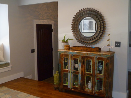
A reclaimed wood cabinet does double-duty as both a mail/key drop off area and bar in the entry space.

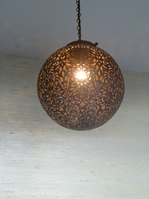
A custom Moroccan pendant hangs in the entry space and casts gorgeous shadows on the ceiling and surrounding walls.

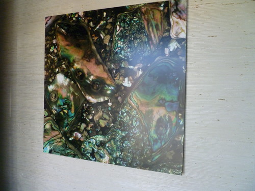
A 36 x 36″ image of abalone was printed onto sheet metal and floated off the grass-cloth covered entry wall. It is the first thing you see when you open the front door.

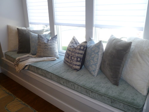
The step-up entry sitting area includes the first of two window seats, and is fitted with a custom velvet window cushion.


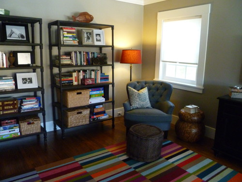
The organic hemp pouf acts as an ottoman or extra seating for the kids when necessary. The striped carpet is made of Flor carpet tiles and can be changed up on a whim. Perfect for kid-friendly family spaces.

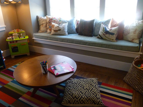
The children use the low coffee table and floor cushions as a place to get creative.

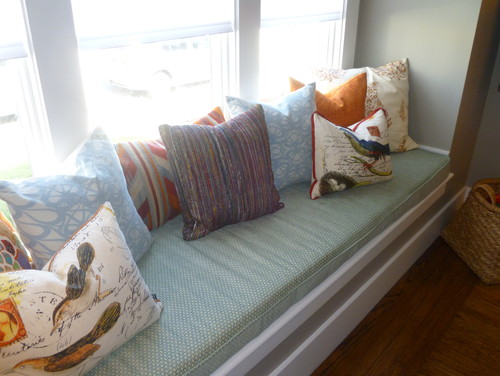
The second extra long window seat cushion is custom made of chenille velvet.

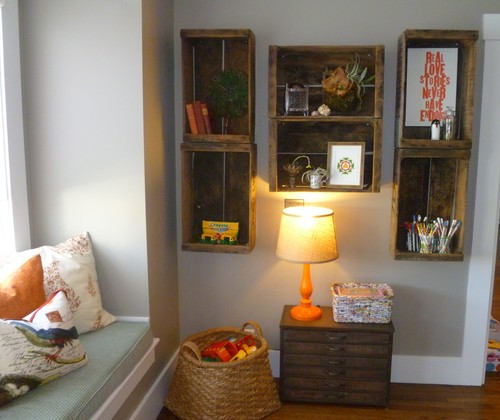
Vintage crates provide both storage for art supplies and display space for meaningful items.

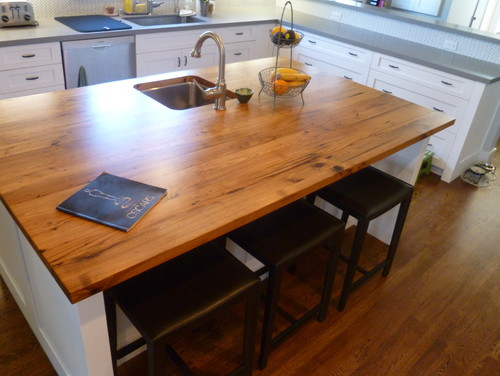
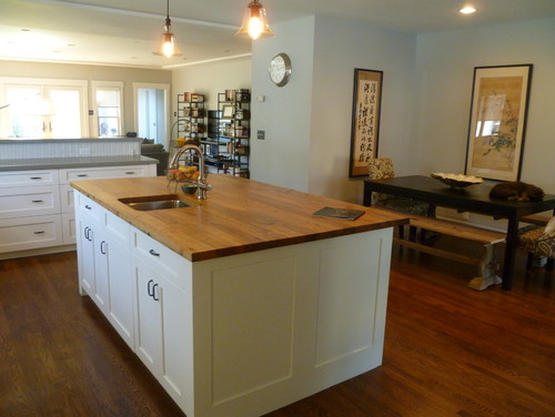
The large kitchen island is topped with a gorgeous slab of reclaimed wood.

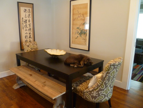
The eat-in kitchen includes a larger-style dining table flanked by antique Korean scrolls that are family heirlooms. Ziggy wanted to be in the photo so he got to stay.

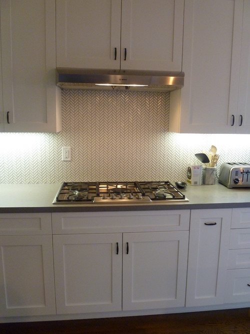
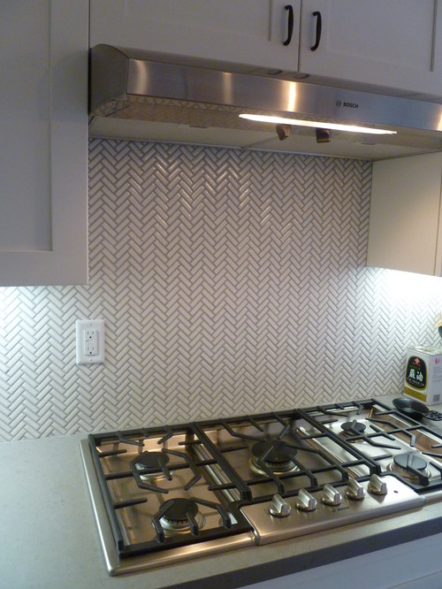
The small-scale subway tiles laid-out in a Chevron pattern compliment the modern polished cement kitchen counters.

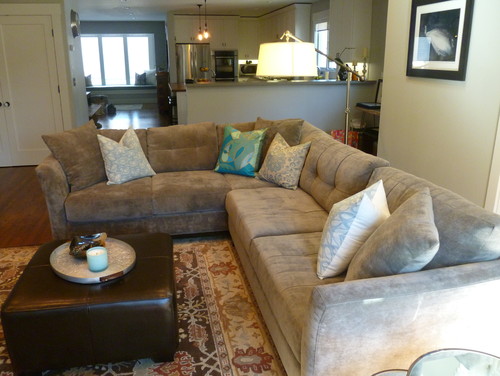
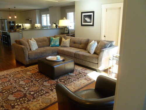
The large sectional provides a comfortable place for the family to watch movies together. The over-size jointed steel floor lamp provides unexpectedly soft lighting.

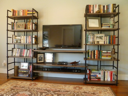
The industrial-style media center keeps the space interesting.

Details make every house a home.

Back to Main Site
Baywood Residence

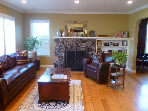
A San Mateo couple with a young daughter requested that I do a makeover on their space utilizing existing furnishings where possible. Art and accessories warmed up the space and gave the rooms a more finished look. Husband and wife have somewhat divergent styles, so finding a happy medium and incorporating family heirlooms was key to the project’s success. The rooms needed to welcoming, reflect who the couple is at this stage in their lives, and be able to withstand their energetic little girl.

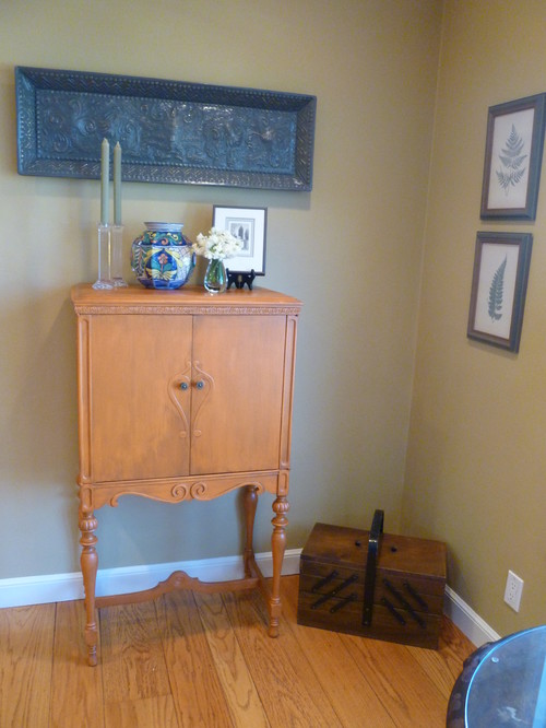
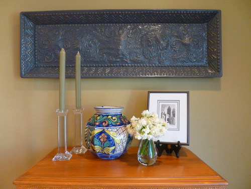
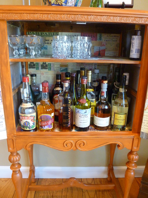
I painted an antique cabinet to use as a bar.

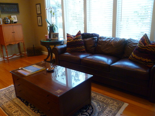
The leather sofa and chair, as well as the coffee table, were purchases the couple previously owned. The tables were topped in tempered glass with polished edges to stand up to the daughter’s toys and activities.

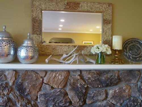
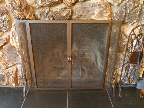
The fireplace will be re-surfaced eventually. The 70’s brass and iron mesh curtain was removed and an updated flush fireplace screen was put in its place.

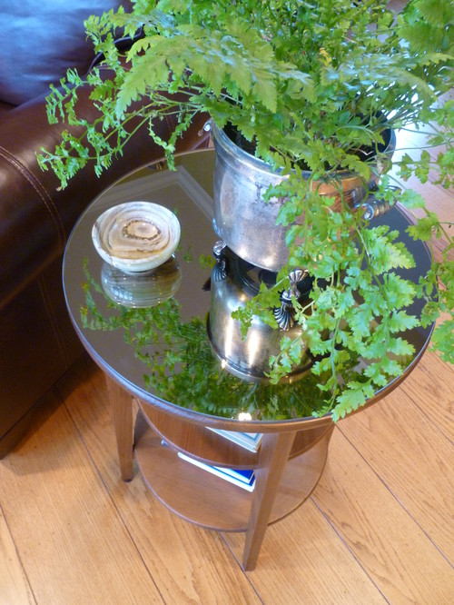
The side table was something the family already owned.A bronze mirror was cut for the top and it was stained darker.

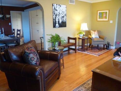
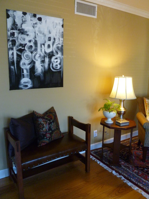
The leather-covered bench was placed against the wall to be used as optional seating for guests.

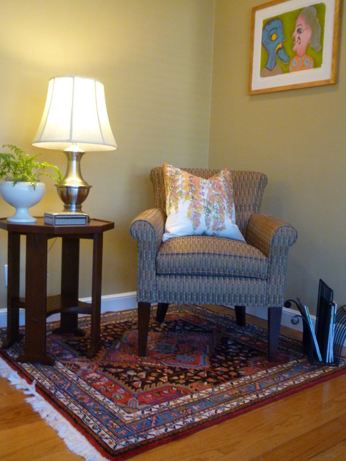
The family has a number of heirloom carpets. A smaller one was used to create a reading area within the larger living space.
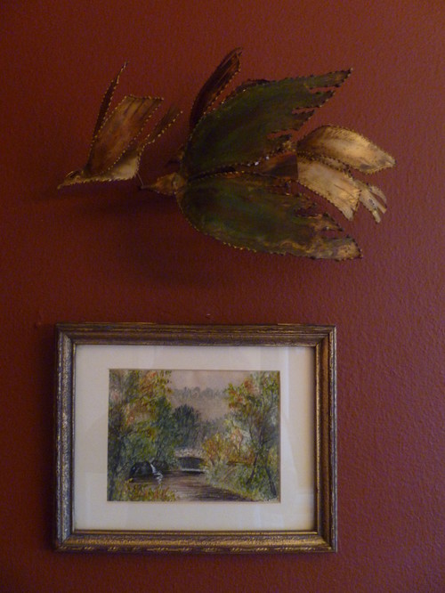
The addition of art will be an evolving process for the homeowners. A 1968 screen print titled Leili and Majnon was finished in a nondescript frame so it was gold-leafed and distressed to add more depth.

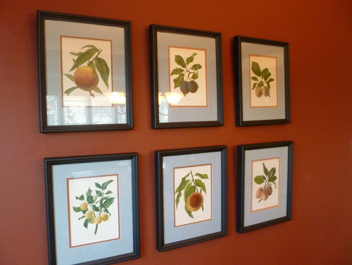
The grouping of vintage fruit prints is on the dining room wall. The room is still a work in progress – Above and below is a sneak peek.

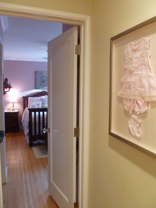
A handmade baby outfit from Puerto Rico was shadowboxed and hangs at the entrance to the daughter’s bedroom.

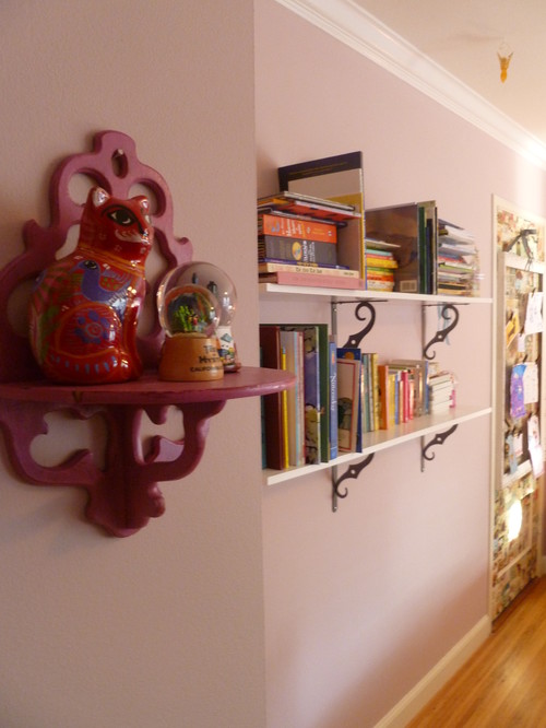
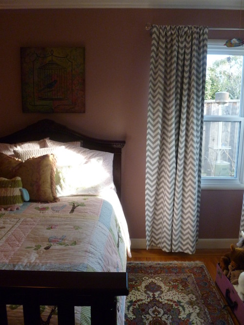
The vintage painted shelf in the daughter’s room allows her to display her ever-rotating treasures.

Vintage unframed art adorns one wall.

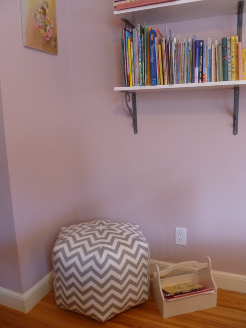
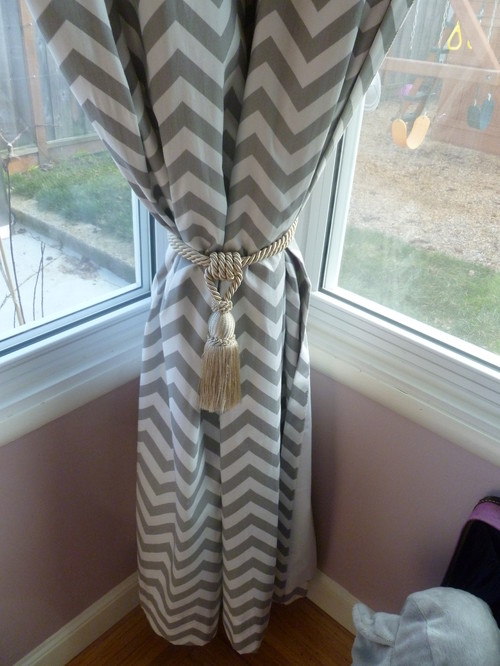
A pouf matches the custom draperies, and sits underneath two long shelves holding the daughter’s books. A bookcase would have taken up too much room on the floor, and the walls were a great use of space.

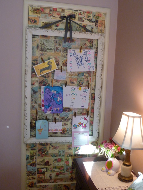
The layout of the room includes an extra door that is never used. It cannot be removed because of code so it was papered and hung with framed chicken wire that displays the daughter’s artwork with clothespins.

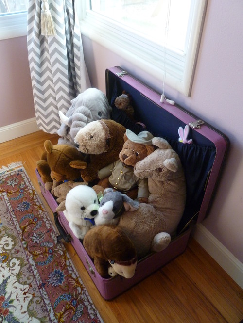
The stuffed animals occupy a painted vintage suitcase.

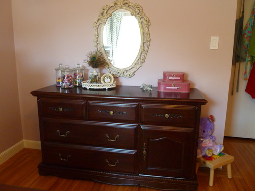
The bedroom furnishings were a present from the in-laws, the mirror is vintage.

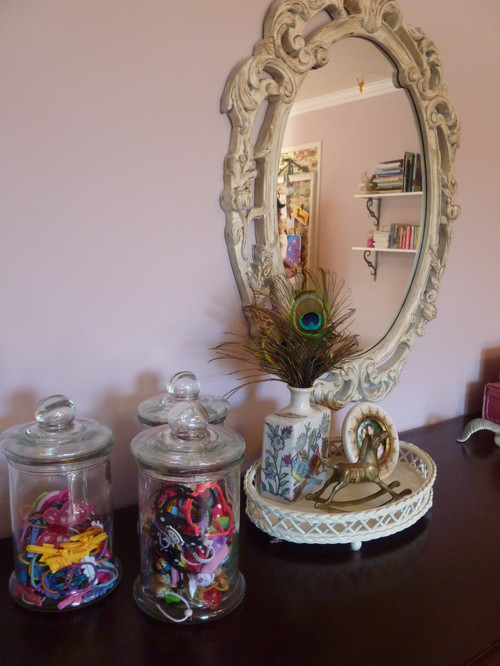
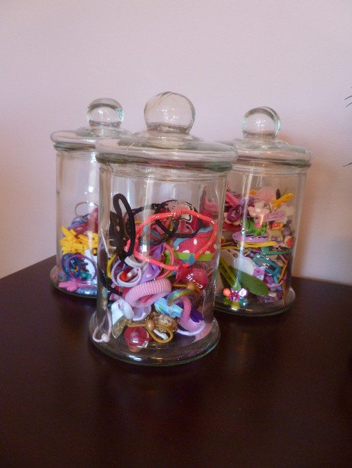
The antique pharmacy jars hold the daughter’s wide selection of hair clips, ties and accessories.

Back to Main Site