I have an obsession with animal-footed furnishings. I don’t even know when that started or why my world won’t be complete without them, but I know I need them in my life. Brass hooved and animal-footed pieces have been around for hundreds of years and have lived in the most luxurious homes – gracing castles, English country estates, and posh dining rooms the world over. In these very serious spaces they brought a touch of whimsy and mystery. In today’s homes, animal-footed furnishings play nicely with everything from traditional settings to ultra-modern surroundings.
DIY Ideas from a Sleepless Mind – Drink Tables
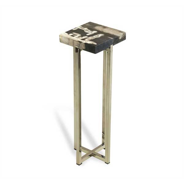 I am in love with this little table – the price, not so much. It’s called the “Argo” and it costs anywhere from $350-$550 depending on where you look. It’s a drink table and as the name implies, it gives you space to set a drink or two. I am obsessed with drink tables, and I think they have a place in every home, however I don’t think they need to be $500.
Anyway, for the past two weeks I have had the “creative crazies”. I have a ton spastic energy and far too many ideas. I have also been on a mad purge, going through all of my design files and magazines in an attempt to distill it down to what inspires me most. Take last night for instance, I was sitting on the couch enthralled by a renovations episode on HGTV when I was suddenly compelled to create my own mirror-topped drink table.
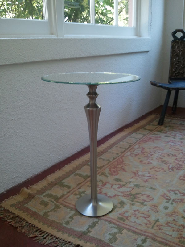
I used a brushed nickel floor candle holder and a mirrored tray. The candle holder had been on my fireplace hearth for over a year and the tray was happily living at our shop, Apartment 46.
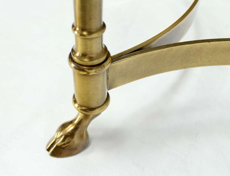
I literally got in my car and drove to my store in the middle of the night because I was obsessed with my own idea. Both items were then combined with a healthy dose of epoxy and are now celebrating their new incarnation as a drink table in someone else’s living room, (because I was talked into selling it). I loved my own idea so much I repeated it with a vintage brass table base and a papier mache Italian tray.
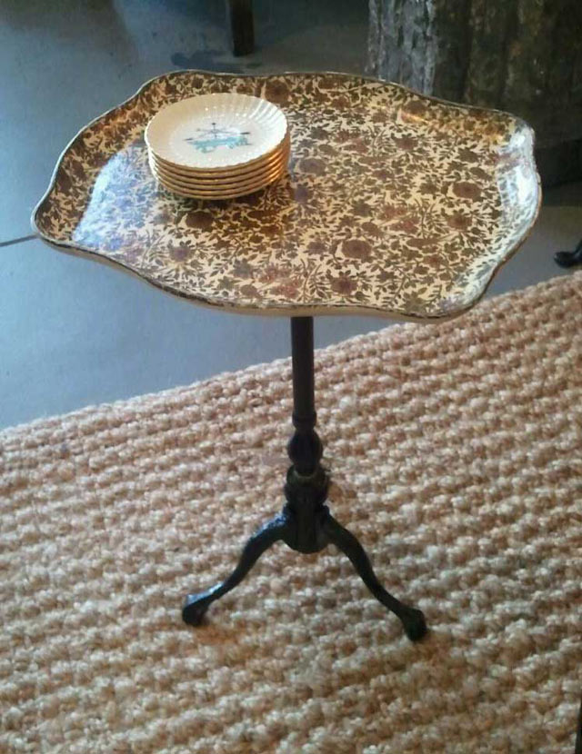 The old design adage is that for every chair there should be a place to easily put your drink – and I love that. A coffee table is great if you can reach it from every seat in the room but that’s not often the case. You don’t need to have a large side table to place a glass on, you need a candle base or an old table base and a sturdy tray!
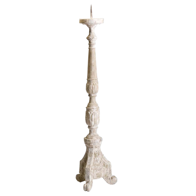 If you want to use a candle holder as your table base, be sure it’s a floor candle holder. You want it to be tall enough to be useful. Also, ensure that it has a weighty, sturdy bottom to balance out any top-heaviness of a tray plus drinks. This stone floor candle holder is definitely weighty enough, and the spike can be removed. Many tall candle holders have a metal spike in the center to hold a candle steady. These can be broken off with a solid pair of pliers or nail/bolt cutters. Sometimes they come off easily, sometimes it’s a bit of a struggle so be careful! If you end up taking a chunk out of the candle holder that’s okay. Your tray will cover it.
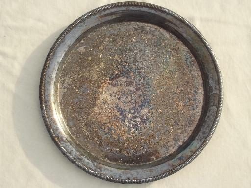
I love the idea of tarnished silver trays as drink tables. There is something soulful and bittersweet about old silver and it’s fantastic when utilized in an unexpected way. Metal trays are also a great counterpoint to a wood or stone base.
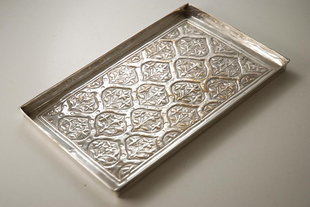
Don’t feel you have to stick to round when it comes to the tabletop shape. You can use a rectangular or oval tray and create something unique and fabulous. The Italian tray I used was an exaggerated rectangle. The antique sterling tray above would be beautiful as a drink table and it would likely get much more use and admiration than if it were sitting on a shelf somewhere. I am always trying to find a way to re-purpose vintage items in fresh new ways. For me, it’s all about giving something new life in today’s world and drink tables are versatile and super convenient for space-constrained homes.
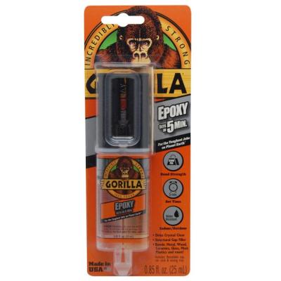
Lately I’ve been super into two-part epoxy because it holds incredibly well and is relatively easy to apply. You take off the tip and squeeze it onto a piece of cardboard or heavy duty paper and kind of mix it up and apply it. I use a paint mixing stick to smear it onto the flush part of the candle holder because it’s thick and messy. I also apply it to the bottom center of the tray I’ve chosen.
Use a generous amount and wipe off whatever seeps out once the tray and base have been connected. I like to turn my pieces upside down to cure because the weight of the bottom piece gives it a tighter seal. You could also put something heavy in the center of the tray but it may fall off or fall over. I learned the hard way that upside down works best for me.
Epoxy creates strong fumes so I recommend applying it outdoors and letting it cure before bringing your piece inside. I checked my tables after a couple hours just to be sure the tray top hadn’t shifted and brought them in fully cured the next morning.
If you end up making a drink table of your own please send me pics! I’d love to see your creations.
Happy Making!
Melisa
Back to Main Site
Creating Curious Displays
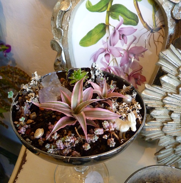
There’s a romantic crispness to the air right now. Night comes earlier and it’s the perfect time to cocoon under warm blankets in candlelit rooms. It’s my favorite season of the year. As the last days of summer disappear, creative souls start bursting at the seams with ideas for their Halloween and Fall displays. I’m not known to be a thematic sort of girl and I don’t “do” holiday specific windows at Apartment 46. However, I’m all for unpredictable and imaginative displays, and I am nearly always designing some take on a cabinet of curiosities. In fact, our whole shop is modeled on what I believe a curious collector’s apartment would feel like.
Modern Romantic – Simple Seductive Style
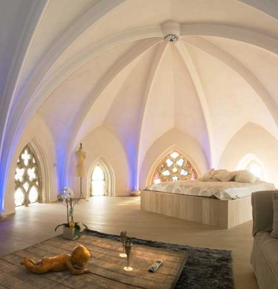
How would I describe a romantic room? I don’t think of it as a room where the romance necessarily happens, but a space that inspires a romantic feeling. The Fontana Park Design Hotel in Lisbon, Portugal (above) is a perfect example for me. Luxurious, other-wordly, and deceptively simple and elegant. It’s like roaming around on a cloud.
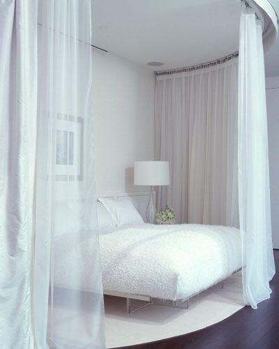
Romance in design is about lighting, textures, colors and overall ambiance. While sexy spaces are very similar, they’re a little darker, edgier, and secretive. A romantic space is more airy, melancholy, sweet, and ethereal. Think medieval maiden mixed with Flokati rugs and billowing linen window coverings. There is usually an element of fantasy in a romantic room intertwined with soft fabrics. Benjamin Noriega Ortiz does an amazing job of creating beautiful rooms that are modern, eclectic, and interesting.
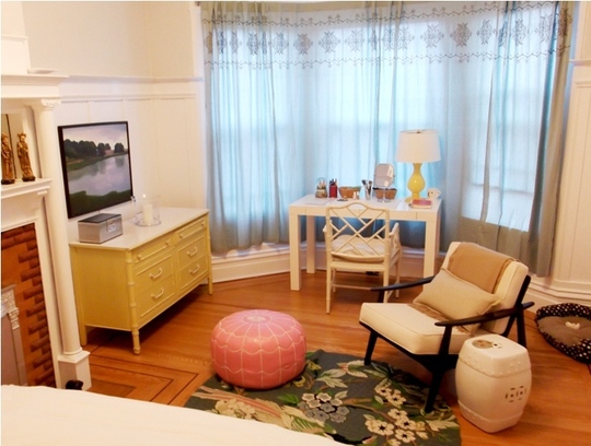
Although pink, fluffy, ruffly, and floral are usually associated with the word romantic, there are many ways to interpret those design elements and keep it modern and fresh. Featured on Apartment Therapy, Cynthia and Oliver’s San Francisco flat has all of above but it was done in a chic, warm, comforting, stylish way. The lines of the furniture are soft and curved, the materials – leather, ceramic, lacquered wood – are sleek and smooth. It’s all pretty seductive!
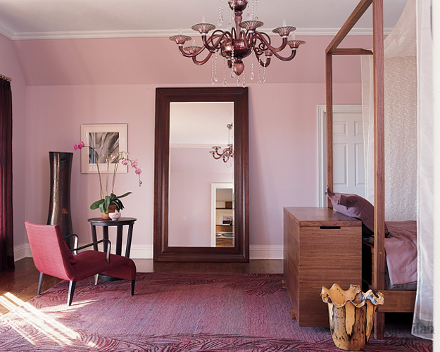
Modern Romantic is as much about the physical aspects of a room as it is the way a room makes a person feel. Above, the mix of heavy and curved lines, spare but elegant accessories, and pink tones creates a blend of feminine and masculine that is a little mysterious and a little melancholy. It’s a contemporary but romantic interpretation of a sitting room.
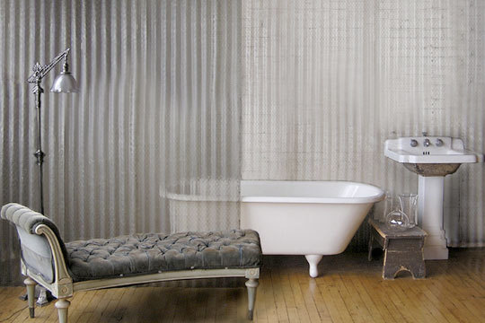
I am madly in love with this bathroom. The industrial + glamor combination is heady stuff for me. It’s such a small gathering of things but it invites you to imagine an interesting, complex and impossibly chic person living there. Velvet, vintage, glass, warm wood, cool steel…it’s all completely romantic.
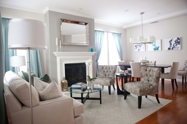
Grace and Dennis Hu’s living room is a good example of Modern Romantic. The raw silk curtains, deep sofa, velvet pillows, brushed nickel and crystal accessories, tufting…Of course, style is subjective. My definition of romantic design is tied to my own likes and dislikes. I absolutely hate chintz and fringed sofas but many people think it creates a romantic ambiance. I think of it as elderly. For some, candles are romantic, but putting them in a Super 8 motel room won’t transform it into a romantic room (sorry). In the end, a room is a room and it’s very much about the memories you create in it and the things it inspires you to do.
Melisa
Back to Main Site
Cheap vs. Chic
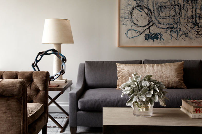 I am mad about New York-based designer James Huniford. This room he designed above and everything in it – yes please! His rooms are places people could actually live in, and that’s important to me. I don’t want to merely possess a space, I want to be a part of it. I am smitten with his individual pieces and his intense attention to detail. Craftsmanship matters, especially when you are deciding which pieces will be an “investment” and which are functional and less costly.
Speaking of less costly, anyone that has worked with me knows that I don’t advocate spending money on expensive furnishings just because they exist. There has to be a reason. There are times I get really upset flipping through my Elle Decor, Veranda, Traditional Home, or Dwell – they show amazing rooms meant to inspire a wide and varied readership but likely only 2% of that readership could actually afford to purchase the items in those same rooms. This morning I was reading Veranda and came to their New and Noteworthy page. I was excited they featured a Huniford chair, at a not-insignificant cost of $3700, but dumbfounded that they also featured a Bottega Veneta trash can, or as BV calls it, Intrecciato Nappa Paper Basket, in woven leather, for $850. A trash can. Made of leather. To put my trash in. (Insert blank stare here) I am confused as to who they believe their demographic is.
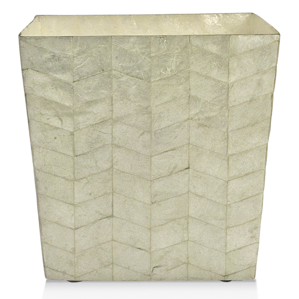
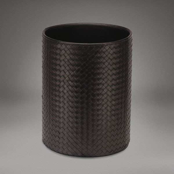 There is probably nothing anyone can say to me to make the purchase of this “paper bin” worthwhile. If you are willing to go that route I will happily purchase you an equally stylish trash can and take the remaining $800 and donate it to one of my favorite charities (or suggest you do the same). Of course there is a huge gap in stylishness between a $9.00 bin and a higher-end container, but a stylish bin to hold your trash never needs to cost three figures. In fact, I just found a gorgeous bin made of capiz shell for $45 and that felt weirdly indulgent.
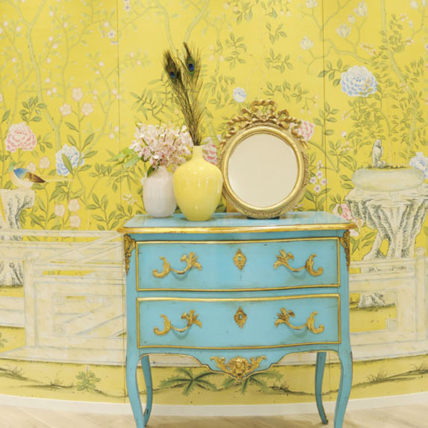
 Things that are well-made are almost always more expensive and worthwhile. Like absolutely everything from de Gournay.
 However, things that are beautiful, or chic, don’t always need to be expensive. Many people are conditioned to believe that if they get it at Target, it’s cheap or if it comes from Home Goods, it’s tacky. While this can be true, both of these stores offer some amazing finds if you know what you’re looking for. I wouldn’t buy my next sofa at a discount store as I already made that mistake and regret it every time I sit down on it. However, I’m redoing my bedroom on a really tight budget and my investment will be my mattress. I’ll be using a Thomas O’Brien for Target vintage modern bedding set mixed with the Nimbus Duvet cover from Anthropologie and have a gorgeous room I’m proud of.
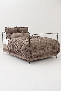 Neither are totally expensive, but both feel amazing and look great. So while I don’t always agree that you can outfit your complete home on the cheap, I strongly believe that you can make it completely chic within any sized budget.
All my best,
Melisa
Back to Main Site
It’s All About Curating – Not Copying
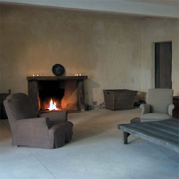
Several months ago I wrote a post about Restoration Hardware’s ad campaign and how much I hated it. So now I need to backtrack a bit. Having now been in to RH to see the pieces individually, in all of their Belgian-Axel Vervoodt-inspired glory, I am totally in love. Axel is one of my biggest design inspirations. He has a style that verges on really spare, but is full of warmth, like a super-comfy weekend cottage. All of his designs have an organic bent, as if they just occurred on their own and were always meant to be there.
What is “Industrial” Really?
Flipping through the latest issue of Elle Decor I came across the new Restoration Hardware ad campaign. They’ve taken a new direction and that’s good, however, I think someone drank too much of the Kool-Aid with respect to the “industrial” bent of the room styling.
Fabulous Finds for the Budget Impaired
I love the space and time that we’re in when it comes to interior design. There has never been a moment like this one – a place where industrial, French, traditional, vintage, ethno-glamour, and minimalist can co-exist at auction, on fabulous web sites, and even in one home! While of course there are still firm believers in the mono-culture of specific design styles (mid-century modern anyone?) it’s an exciting time to be re-doing your space as there is so much amazing treasure out there to find!

