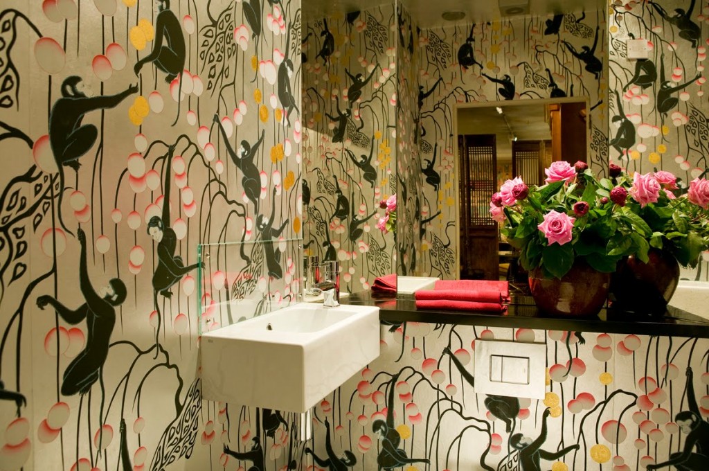
Let’s put it on the table straight away. I love wallpaper. Would I paper an entire house? Probably not. For one thing, the paper I covet is probably the most costly available, and for another, I am a renter, so I’m saving that indulgence for my very first home. It’s not for everyone, but the paper above? The monkeys? That’s definitely for me.
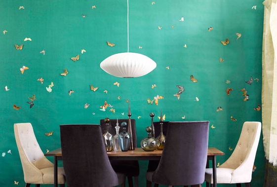
The first time I saw gorgeous, hand-painted wallpaper used in a design magazine, I had just started high school. Up until that point, my only exposure to wallpaper was what I had seen peeling off the dentist’s office walls and the hideous bright yellow floral that adorned my bedroom when my mom first bought the house.
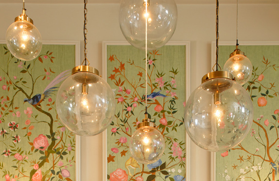
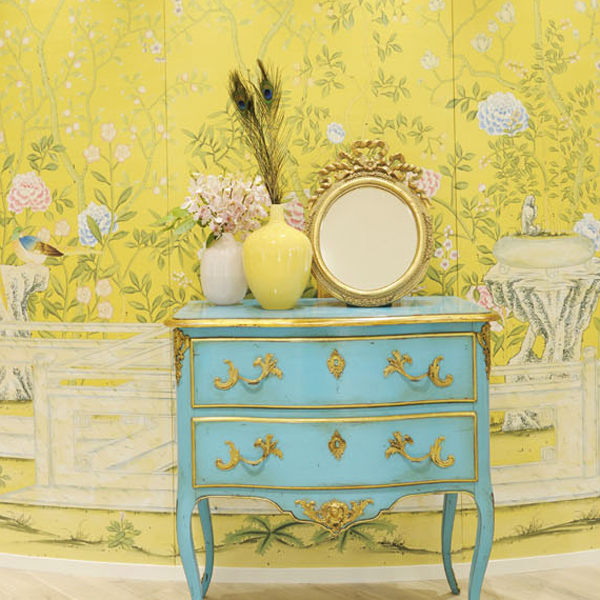
Nothing about the magazine photo stayed in my memory except the wall-coverings, which were a vibrant Chinoiserie scene that included flying birds, cherry blossoms, pagodas, butterflies and branches, and was painted on a soft silver background. It took my breath away. Furniture was inconsequential next to that art. I filed it away in my head with other beautiful things that have left their imprint on me. de Gournay hand-painted wallpaper is, to me, the epitome of luxury and timeless chic.
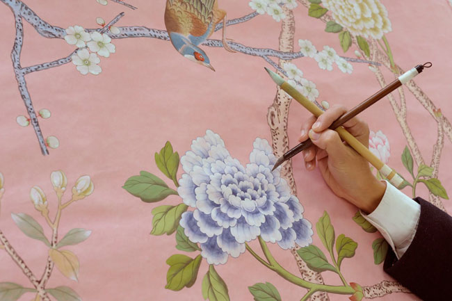
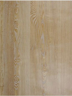
Walls are a very personal thing – both physically and metaphorically. The way you adorn (or not), the walls of your environment says volumes about who you are, and what you are about. While I love the look of great and eclectic art on bright, white walls, I also really, really love faux bois wallpaper and think that I would love to do an entire hallway in it. Nobilis does the most realistic I’ve ever seen.
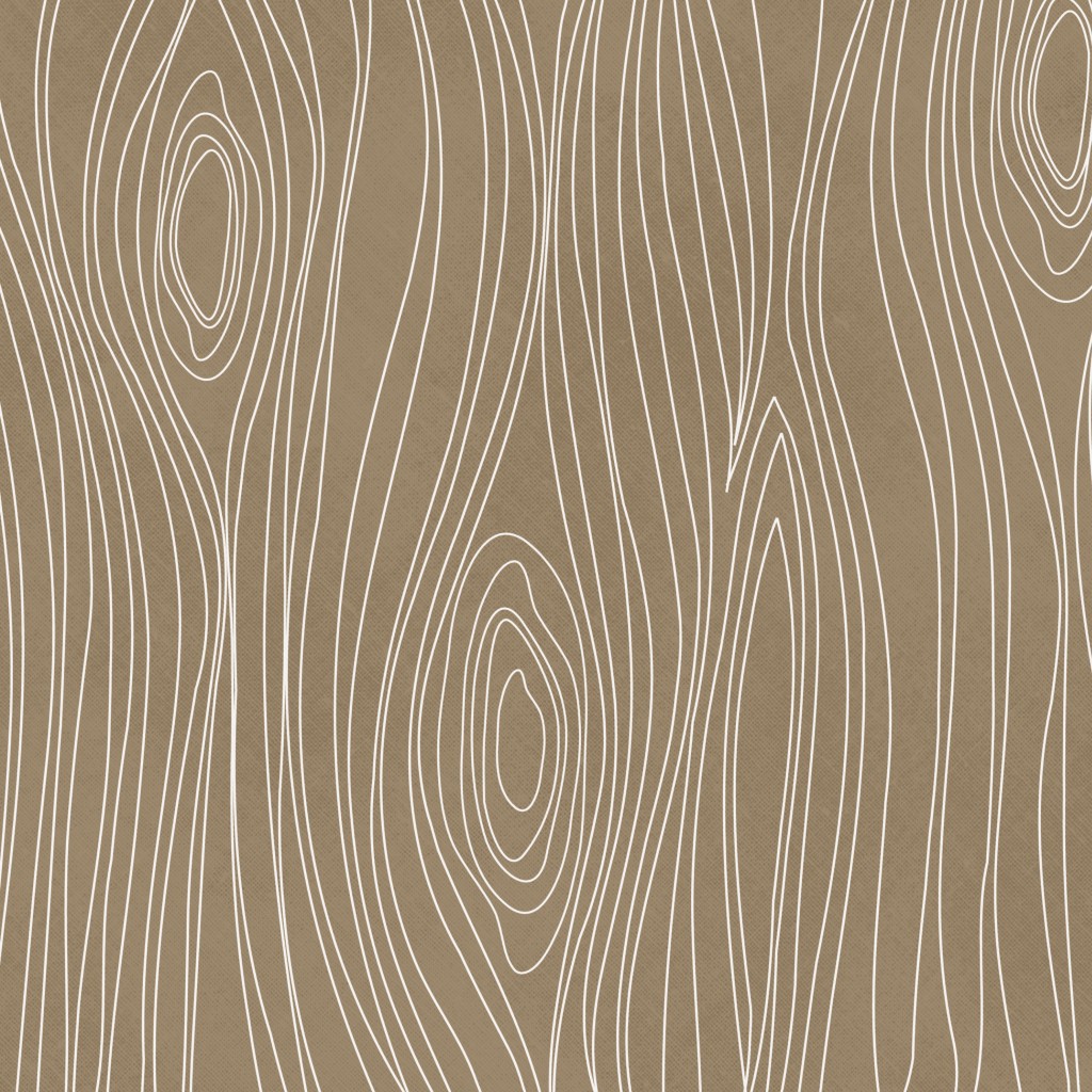
Then again, I also really like the more playful and topographic-map looking faux bois as it would look gorgeous in a modern, minimalist or contemporary home.
But here’s the thing, I am also obsessed with textured walls, and thus, organic wall-coverings. There was a time back in the 70’s and early 80’s when textured wall-coverings were pretty commonplace. I remember my mother painting over some textured brown grass cloth, turning it white, and I thought that wall was the coolest thing I had ever seen afterward! Texture creates a warm elegance that a flat wall just doesn’t have on its own. My favorite place to use texture is in an entryway. Grass cloth is perfect for creating an interesting, high-end and earthy-feeling space.
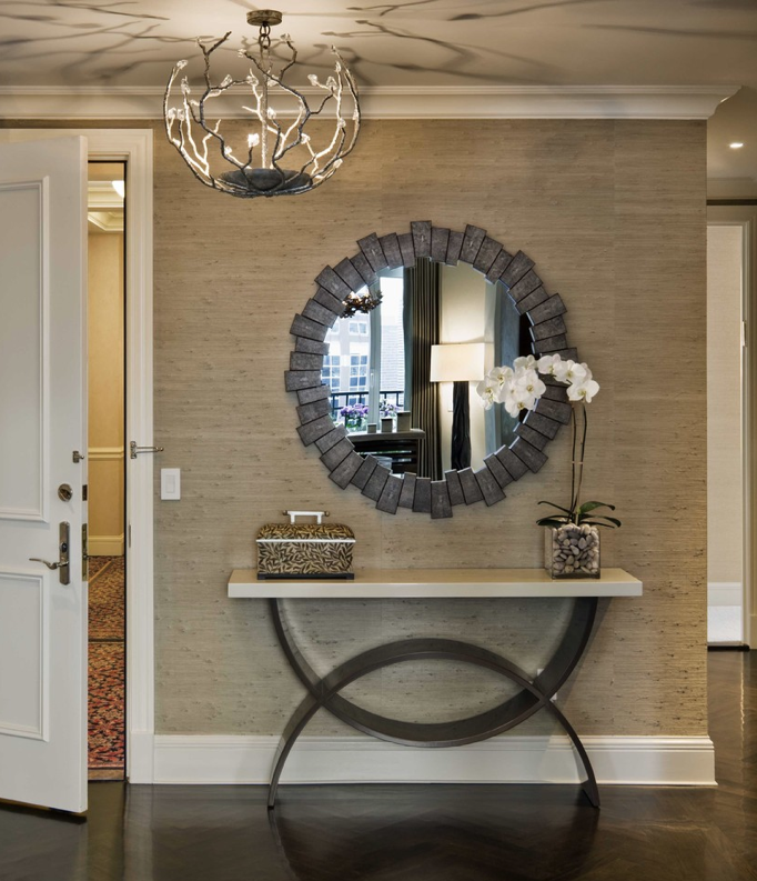
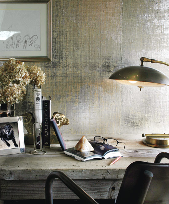
It can be really subtle, (or not) depending on the color and whether it’s metallic. There is nothing quite like metallic grasscloth. It’s absolutely stunning when mixed with masculine and industrial-style pieces.
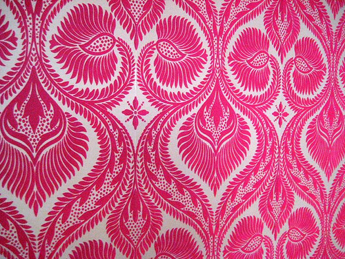
I have to admit I also have a little bit of a thing for pricess-style wallpaper. You know, the soft, fuzzy kind that Cinderella probably had when she moved into the castle? Yeah, I love that too. Design Your Wall has an awesome collection of flocked velvet wallpaper that makes me fall in love a little bit more every time I see it. The ultimate in textured paper, it definitely evokes a retro-brothel feel that I think would be so wicked in a small bathroom or a woman’s dressing room. It’s fun, unique and definitely over-the-top princessy.
If I were going to forgo wallpaper, I would probably opt for large-format art for my walls. I am completely smitten by the look of a single wall done in one giant, graphic image. Like a feature wall, but without the paint. I was digging through a pile of old design magazines and found a 2009 issue of Elle Decor UK, (now called Elle Decoration) and re-discovered Tektura, a UK-based company that turns digital photographs into large-scale vinyl wall coverings. Although it’s a 4-year old idea, it feels fresh to me, and I’m pretty sure I need it. In my future dream home, I will have them turn the below image of a fighter-pilot’s helmet into a floor-to-ceiling piece of art – and I will love it madly. I have carried this image with me for years, knowing that one day, it would be on the wall of my home.
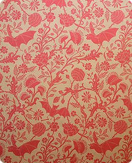
Seven years ago I learned about Flavor Paper in NYC and went a little bit mental ordering samples. I decided that there is definitely a project out there in the world that requires me to install their hand-screened Elysian Fields paper in a nursery, counseling office, or some other totally cheeky place. The black and purple colorway almost made its way onto the walls of my shop, but I am constantly nailing things to the walls and that wouldn’t be good for the paper.
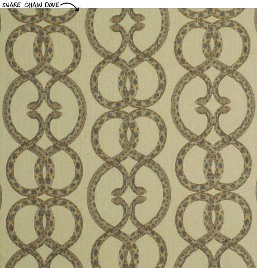
Just saying the word “wallpaper” used to bring to mind a grandmother’s house, or a stuffy, cold manor on a bog. Today’s bold patterns and modern colorways have given new life to wallpaper and a new opportunity to do something different and graphic in your space. Dwell Studio has a line of wallpaper that’s both modern and edgy. My heart beats a little stronger for their Snake Chain pattern, which looks like basic curled “S” shapes until you get up close. LOVE it.
I am going to be experimenting with some of Tempaper’s removable wallpaper in my dining area. For us renters, it’s kind of a dream come true! My dining space is very small, and very boring, and I’ve painted it more times than I care to admit and it still makes me sad. I’ll keep you posted on how it turns out and whether it was really “removable.”
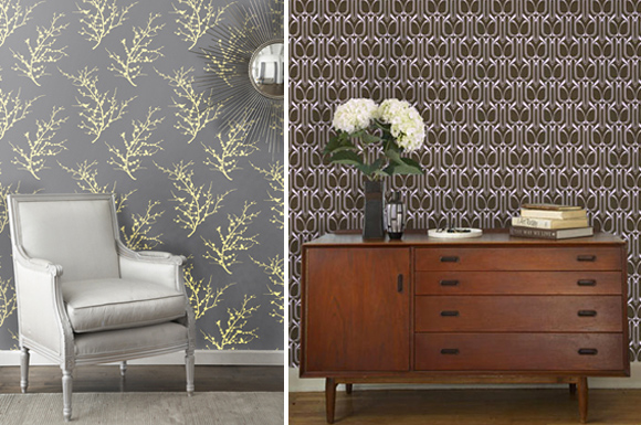
So next time you are thinking about refreshing your space, consider adding a bit of interest with wallpaper. Whether your style is conservative, traditional, playful, eclectic, or minimalist, there is a paper in this world for you. You just have to pick one you like and get it up on those walls!
Wishing you much inspiration,
Melisa
Back to Main Site


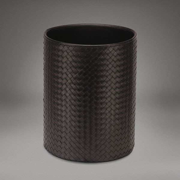
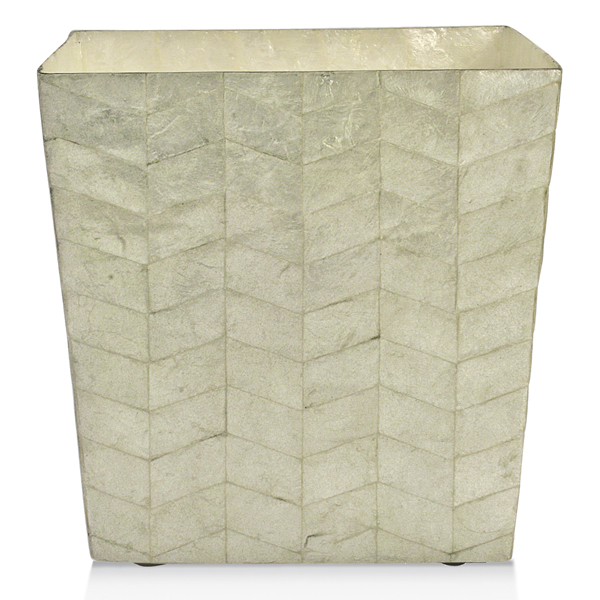 Things that are well-made are almost always more expensive and worthwhile. Like absolutely everything from
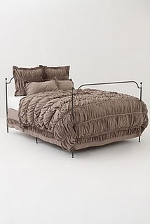 Neither are totally expensive, but both feel amazing and look great. So while I don’t always agree that you can outfit your complete home on the cheap, I strongly believe that you can make it completely chic within any sized budget.