DIY Ideas from a Sleepless Mind – Drink Tables


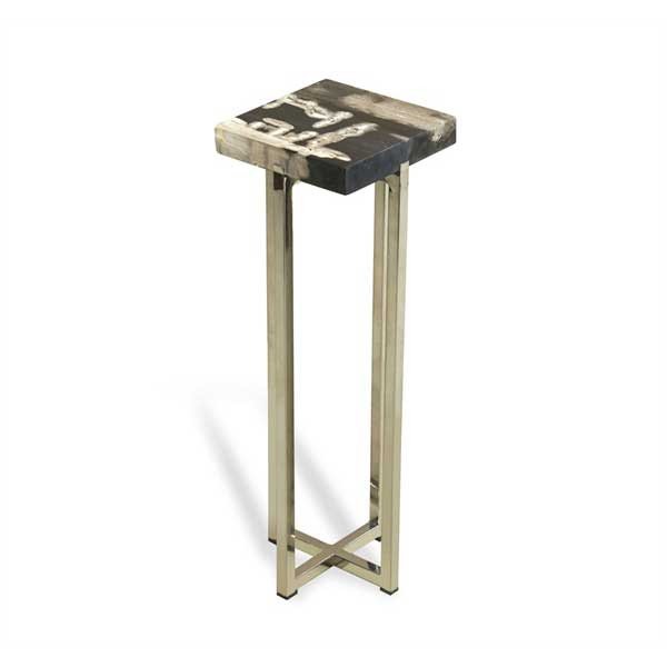
IH-155040I am in love with this little table – the price, not so much. It’s called the “Argo” and it costs anywhere from $350-$550 depending on where you look. It’s a drink table and as the name implies, it gives you space to set a drink or two. I am obsessed with drink tables, and I think they have a place in every home, however I don’t think they need to be $500.

Anyway, for the past two weeks I have had  the “creative crazies”. I have a ton spastic energy and far too many ideas. I have also been on a mad purge, going through all of my design files and magazines in an attempt to distill it down to what inspires me most. Take last night for instance, I was sitting on the couch enthralled by a renovations episode on HGTV when I was suddenly compelled to create my own mirror-topped drink table.
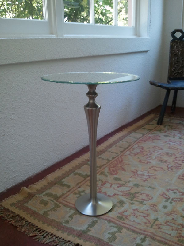

I used a brushed nickel floor candle holder and a mirrored tray. The candle holder had been on my fireplace hearth for over a year and the tray was happily living at our shop, Apartment 46.

I literally got in my car and drove to my store in the middle of the night because I was obsessed with my own idea. Both items were then combined with a healthy dose of epoxy and are now celebrating their new incarnation as a drink table in someone else’s living room, (because I was talked into selling it). I loved my own idea so much I repeated it with a vintage brass table base and a papier mache Italian tray.
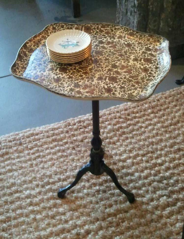
The old design adage is that for every chair there should be a place to easily put your drink – and I love that. A coffee table is great if you can reach it from every seat in the room but that’s not often the case. You don’t need to have a large side table to place a glass on, you need a candle base or an old table base and a sturdy tray!
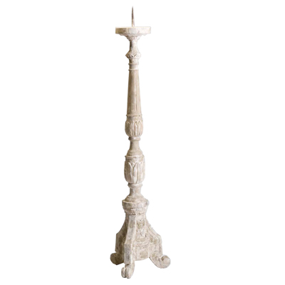
Large Old World Floor Candle Holder_400-01If you want to use a candle holder as your table base, be sure it’s a floor candle holder. You want it to be tall enough to be useful. Also, ensure that it has a weighty, sturdy bottom to balance out any top-heaviness of a tray plus drinks. This stone floor candle holder is definitely weighty enough, and the spike can be removed. Many tall candle holders have a metal spike in the center to hold a candle steady. These can be broken off with a solid pair of pliers or nail/bolt cutters. Sometimes they come off easily, sometimes it’s a bit of a struggle so be careful! If you end up taking a chunk out of the candle holder that’s okay. Your tray will cover it.

vintage-silver-plate-lot-of-round-trays-for-buffet-plates-or-serving-Laurel-Leaf-Farm-item-no-u102915-4

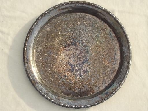
I love the idea of tarnished silver trays as drink tables. There is something soulful and bittersweet about old silver and it’s fantastic when utilized in an unexpected way. Metal trays are also a great counterpoint to a wood or stone base.

Arts_and_Crafts_Silver_Plated_Tray_by_Keswick_School_of_Industrial_Arts-00

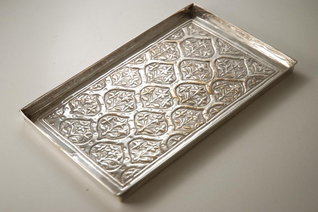
Don’t feel you have to stick to round when it comes to the tabletop shape. You can use a rectangular or oval tray and create something unique and fabulous. The Italian tray I used was an exaggerated rectangle. The antique sterling tray above would be beautiful as a drink table and it would likely get much more use and admiration than if it were sitting on a shelf somewhere. I am always trying to find a way to re-purpose vintage items in fresh new ways. For me, it’s all about giving something new life in today’s world and drink tables are versatile and super convenient for space-constrained homes.

611d835f-f3b9-4ccd-b552-bc7b15c559dc_400

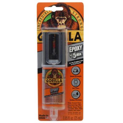
Lately I’ve been super into two-part epoxy because it holds incredibly well and is relatively easy to apply. You take off the tip and squeeze it onto a piece of cardboard or heavy duty paper and kind of mix it up and apply it. I use a paint mixing stick to smear it onto the flush part of the candle holder because it’s thick and messy. I also apply it to the bottom center of the tray I’ve chosen.

Use a generous amount and wipe off whatever seeps out once the tray and base have been connected. I like to turn my pieces upside down to cure because the weight of the bottom piece gives it a tighter seal. You could also put something heavy in the center of the tray but it may fall off or fall over. I learned the hard way that upside down works best for me.

Epoxy creates strong fumes so I recommend applying it outdoors and letting it cure before bringing your piece inside. I checked my tables after a couple hours just to be sure the tray top hadn’t shifted and brought them in fully cured the next morning.

If you end up making a drink table of your own please send me pics! I’d love to see your creations.

Happy Making!
Melisa

Back to Main Site

Hayward Park Residence II

A reclaimed wood cabinet does double-duty as both a mail/key drop off area and bar in the entry space.

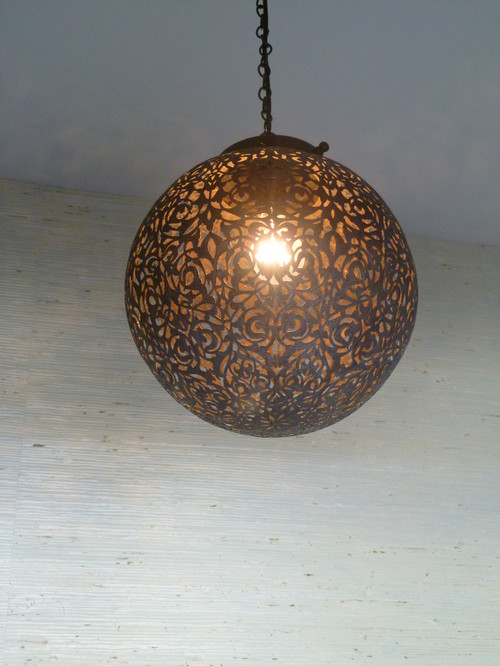
A custom Moroccan pendant hangs in the entry space and casts gorgeous shadows on the ceiling and surrounding walls.

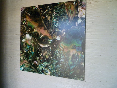
A 36 x 36″ image of abalone was printed onto sheet metal and floated off the grass-cloth covered entry wall. It is the first thing you see when you open the front door.

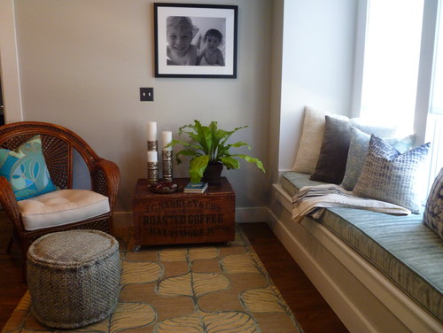
The step-up entry sitting area includes the first of two window seats, and is fitted with a custom velvet window cushion.


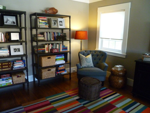
The organic hemp pouf acts as an ottoman or extra seating for the kids when necessary. The striped carpet is made of Flor carpet tiles and can be changed up on a whim. Perfect for kid-friendly family spaces.

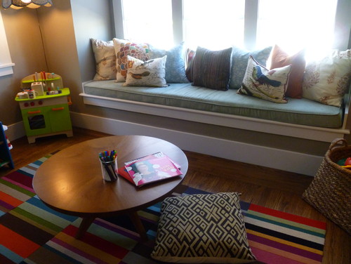
The children use the low coffee table and floor cushions as a place to get creative.

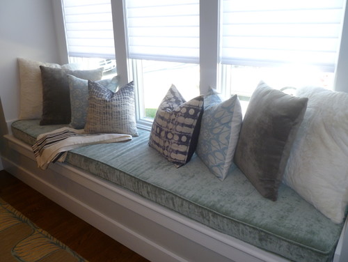
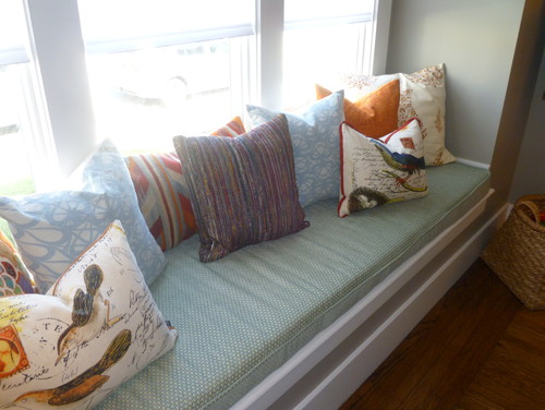
The second extra long window seat cushion is custom made of chenille velvet.

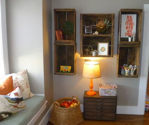
Vintage crates provide both storage for art supplies and display space for meaningful items.

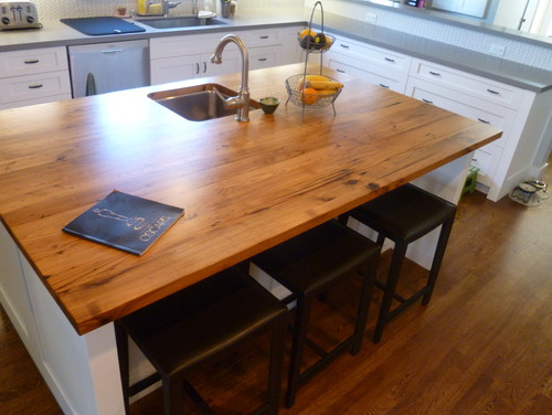
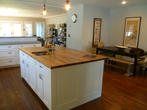
The large kitchen island is topped with a gorgeous slab of reclaimed wood.

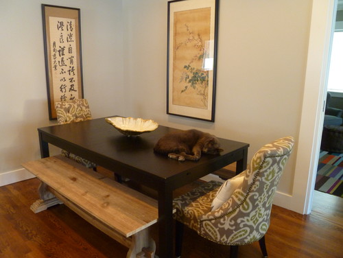
The eat-in kitchen includes a larger-style dining table flanked by antique Korean scrolls that are family heirlooms. Ziggy wanted to be in the photo so he got to stay.

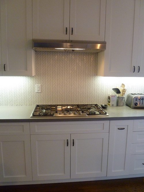
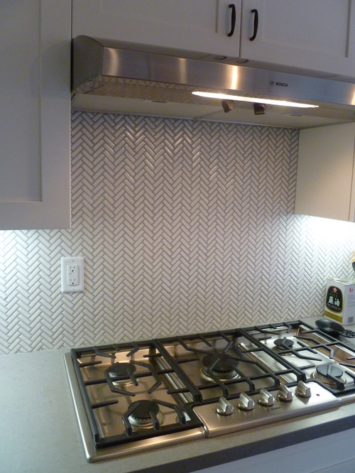
The small-scale subway tiles laid-out in a Chevron pattern compliment the modern polished cement kitchen counters.

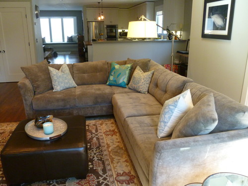
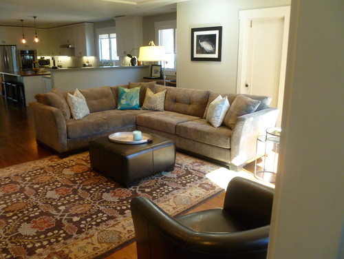
The large sectional provides a comfortable place for the family to watch movies together. The over-size jointed steel floor lamp provides unexpectedly soft lighting.

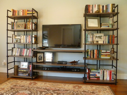
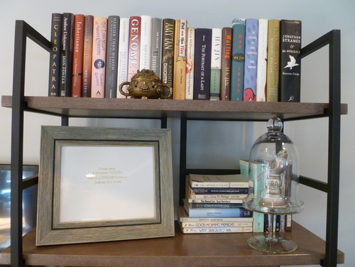
The industrial-style media center keeps the space interesting.

Details make every house a home.

Back to Main Site

The Wonder of Wall Coverings

de Gournay hand-painted wallpaper

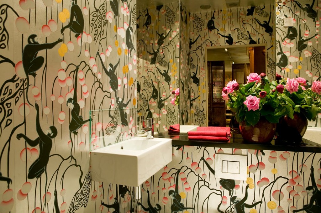
Let’s put it on the table straight away. I love wallpaper. Would I paper an entire house? Probably not. For one thing, the paper I covet is probably the most costly available, and for another, I am a renter, so I’m saving that indulgence for my very first home. It’s not for everyone, but the paper above? The monkeys? That’s definitely for me.

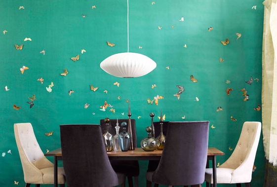
de Gournay butterflies

The first time I saw gorgeous, hand-painted wallpaper used in a design magazine, I had just started high school. Up until that point, my only exposure to wallpaper was what I had seen peeling off the dentist’s office walls and the hideous bright yellow floral that adorned my bedroom when my mom first bought the house.

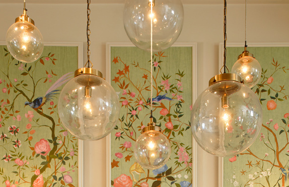
de Gournay panels
de Gournay panels

Nothing about the magazine photo stayed in my memory except the wall-coverings, which were a vibrant Chinoiserie scene that included flying birds, cherry blossoms, pagodas, butterflies and branches, and was painted on a soft silver background. It took my breath away. Furniture was inconsequential next to that art. I filed it away in my head with other beautiful things that have left their imprint on me. de Gournay hand-painted wallpaper is, to me, the epitome of luxury and timeless chic. 

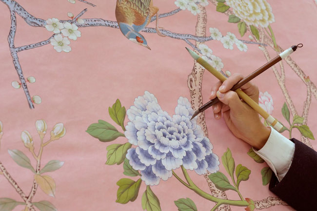
de Gournay
de Gournay

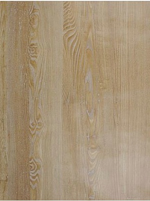
Walls are a very personal thing – both physically and metaphorically. The way you adorn (or not), the walls of your environment says volumes about who you are, and what you are about. While I love the look of great and eclectic art on bright, white walls, I also really, really love faux bois wallpaper and think that I would love to do an entire hallway in it. Nobilis does the most realistic I’ve ever seen.

Nobilis faux bois
Nobilis faux bois

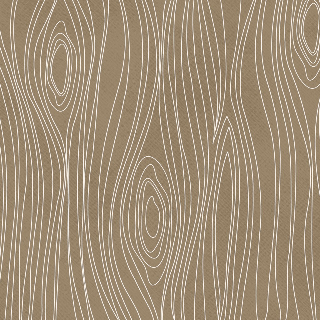
Then again, I also really like the more playful and topographic-map looking faux bois as it  would look gorgeous in a modern, minimalist or contemporary home.

AVictoria faux bois
AVictoria faux bois

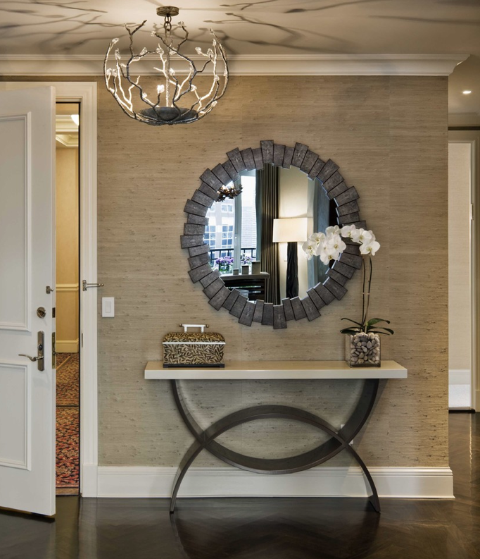
But here’s the thing, I am also obsessed with textured walls, and thus, organic wall-coverings. There was a time back in the 70’s and early 80’s when textured wall-coverings were pretty commonplace. I remember my mother painting over some textured brown grass cloth, turning it white, and I thought that wall was the coolest thing I had ever seen afterward! Texture creates a warm elegance that a flat wall just doesn’t have on its own. My favorite place to use texture is in an entryway. Grass cloth is perfect for creating an interesting, high-end and earthy-feeling space.

Grasscloth Foyer
Grasscloth Foyer

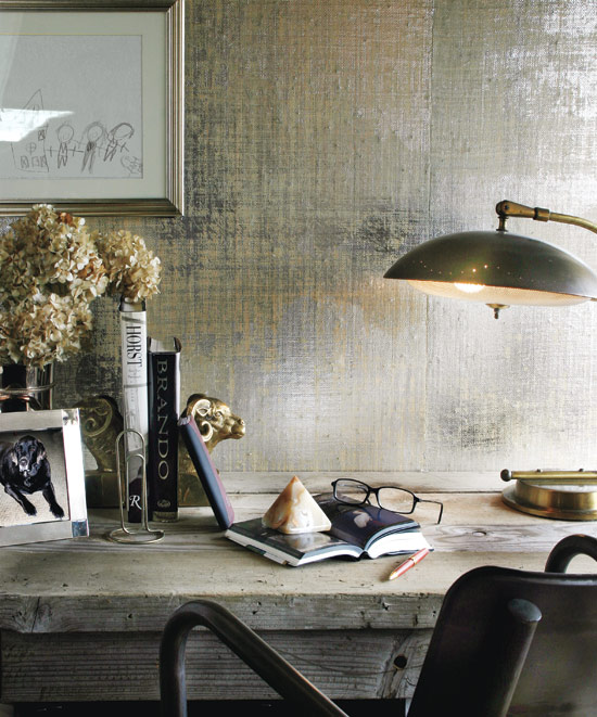
It can be really subtle, (or not) depending on the color and whether it’s metallic. There is nothing quite like metallic grasscloth. It’s absolutely stunning when mixed with masculine and industrial-style pieces.

Metallic grasscloth
Metallic grasscloth

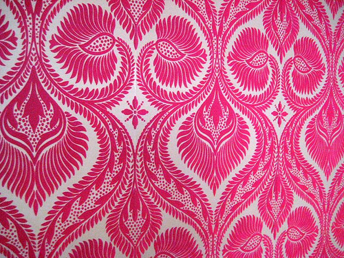
I have to admit I also have a little bit of a thing for pricess-style wallpaper. You know, the soft, fuzzy kind that Cinderella probably had when she moved into the castle? Yeah, I love that too. Design Your Wall has an awesome collection of flocked velvet wallpaper that makes me fall in love a little bit more every time I see it. The ultimate in textured paper, it definitely evokes a retro-brothel feel that I think would be so wicked in a small bathroom or a woman’s dressing room. It’s fun, unique and definitely over-the-top princessy.

flocked velvet wallpaper

If I were going to forgo wallpaper, I would probably opt for large-format art for my walls. I am completely smitten by the look of a single wall done in one giant, graphic image. Like a feature wall, but without the paint. I was digging through a pile of old design magazines and found a 2009 issue of Elle Decor UK, (now called Elle Decoration) and re-discovered Tektura, a UK-based company that turns digital photographs into large-scale vinyl wall coverings. Although it’s a 4-year old idea, it feels fresh to me, and I’m pretty sure I need it. In my future dream home, I will have them turn the below image of a fighter-pilot’s helmet into a floor-to-ceiling piece of art – and I will love it madly. I have carried this image with me for years, knowing that one day, it would be on the wall of my home.

Photo-realistic Charcoal Rendering

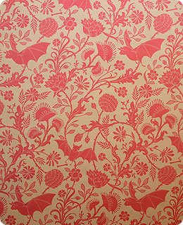
Seven years ago I learned about Flavor Paper in NYC and went a little bit mental ordering samples. I decided that there is definitely a project out there in the world that requires me to install their hand-screened Elysian Fields paper in a nursery, counseling office, or some other totally cheeky place. The black and purple colorway almost made its way onto the walls of my shop, but I am constantly nailing things to the walls and that wouldn’t be good for the paper.

Elysian Fields in Antique Pink by Flavor Paper

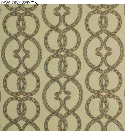
Just saying the word “wallpaper” used to bring to mind a grandmother’s house, or a stuffy, cold manor on a bog. Today’s bold patterns and modern colorways have given new life to wallpaper and a new opportunity to do something different and graphic in your space. Dwell Studio has a line of wallpaper that’s both modern and edgy. My heart beats a little stronger for their Snake Chain pattern, which looks like basic curled “S” shapes until you get up close. LOVE it.

Dwell Studio's Snake Chain wallpaper
Dwell Studio

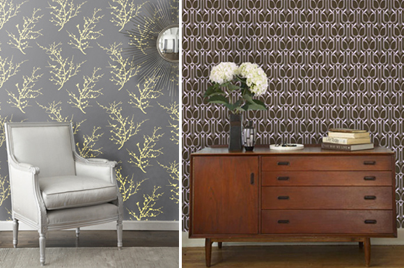
I am going to be experimenting with some of  Tempaper’s removable wallpaper in my dining area. For us renters, it’s kind of a dream come true! My dining space is very small, and very boring, and I’ve painted it more times than I care to admit and it still makes me sad. I’ll keep you posted on how it turns out and whether it was really “removable.” 

Tempaper styles
Tempaper styles

So next time you are thinking about refreshing your space, consider adding a bit of interest with wallpaper. Whether your style is conservative, traditional, playful, eclectic, or minimalist, there is a paper in this world for you. You just have to pick one you like and get it up on those walls!

Wishing you much inspiration,

Melisa

Back to Main Site


Creating Curious Displays

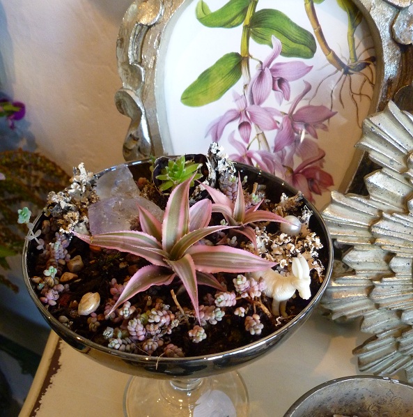
Vintage martini glass planting – Apartment 46

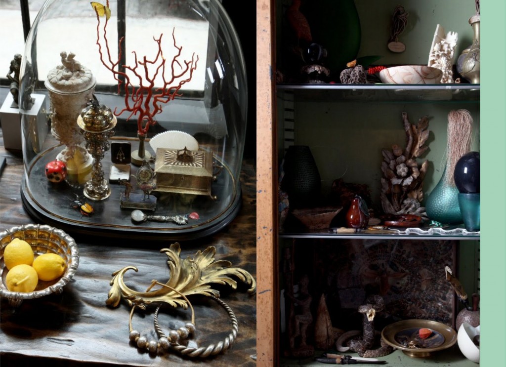
There’s a romantic crispness to the air right now. Night comes earlier and it’s the perfect time to cocoon under warm blankets in candlelit rooms. It’s my favorite season of the year. As the last days of summer disappear, creative souls start bursting at the seams with ideas for their Halloween and Fall displays. I’m not known to be a thematic sort of girl and I don’t “do” holiday specific windows at Apartment 46. However, I’m all for unpredictable and imaginative displays, and I am nearly always designing some take on a cabinet of curiosities. In fact, our whole shop is modeled on what I believe a curious collector’s apartment would feel like.

Continue Reading

We’re An Official One Kings Lane Affiliate!

We are so excited to announce that we’ve been approved as a One Kings Lane affiliate! We have been in love with OKL since the day it began and being able to offer their collection of products through our site is just another way of helping you create an amazing space.

If you’re already a fan, all you have to do is click the banner on the home page of our site and book mark the link and there you go! Each time you log on through the bookmarked link, you’ll be supporting small business as zero extra cost to you. How awesome is that?

If you’ve never been to OKL, then get ready for a double-helping of “yes please!” You’ll wonder why it’s taken you so long. You can join the site directly from my home page. Click the banner, create an account and voila! You’re a super star!

We have some other fantastic things cooking with OKL so we’ll keep you posted. Until then, thank you for loving us as much as we love you.

Melisa

Back to Main Site
 

The Art of Creating an Eclectic Style

Janel and Dave Lehman’s California Home

I’ve written before about eclectic style, and it occurred to me that it was definitely time to revisit the topic. With the increasing popularity of HGTV, and a slew of shows like Design on a Dime, Dear Genevieve, and even American Pickers, people are more daring than ever when it comes to tackling their own decorating.

Continue Reading

Sexy Spaces

Courtesy of High Fashion Home

There are certain spaces that are so compelling to me that they conjure up fantasies of  wine-filled nights or whispers of things I hardly ever share. In my opinion there are a lot of elements that need to come together to make a room truly “sexy”. I love layers of sensual textures, neutral but warm toned walls, dark woods, shiny chrome, sparkly glass, and softness underfoot. Cozy rooms seem more intimate to me. Rooms that have just enough luxe beauty to make them interesting and a bit forbidden. Think Marie Antoinette if she were to move into the W Hotel and make it her own. Supersexy!

Continue Reading

What Exactly is Eclectic?


Courtesy of Anne Sage

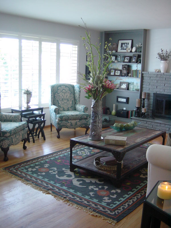
If I had to define my style as an interior designer, I’d say I’m eclectic. But what does that really mean? In my mind, eclectic design is a colorful mix of periods and styles with the unifying themes being comfort and interest. To me, an all white home cannot be eclectic, but others would disagree. I also don’t think bohemian and eclectic are interchangeable words or styles because a bohemian style feels very ethnic or very period – say, 1960’s or 70’s. However, an eclectic space will have touches of bohemian in it. It will also have industrial, traditional, modern, contemporary, and ethnic in the mix but it will rarely be minimalist, although I’m sure it’s possible to do an eclectic-minimalist home.
Continue Reading